¿Qué son las GRÁFICAS y para qué sirven? Características, tipos y ejemplos📊
What Are Graphs and Their Uses?
Introduction to Graphs
- Graphs are visual representations of information, making it easier for viewers to understand complex data.
- They are commonly used in various fields, including education and business, to represent functional relationships between numerical variables.
Purpose of Graphs
- Graphs visually present data on the behavior of one or more variables over time or other dimensions.
- They allow quick access to large amounts of information through visual representation, aiding in quantitative research.
Characteristics of Graphs
- Effective graphs capture attention by presenting numerical information in an easily interpretable format.
- Most graphs consist of two axes (X and Y), with a scale that clarifies the measured variables.
Types of Graphs Explained
Common Types of Graphs
Bar Graph
- Simple structure with vertical (Y-axis) and horizontal (X-axis); items compared on one axis against their values on the other.
Histogram
- A variant of bar graphs showing variable alterations without separation between bars.
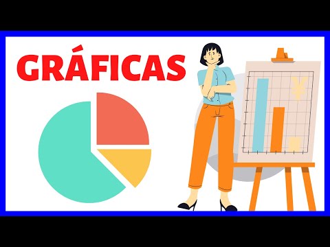
Pie Chart
- Represents percentages as portions of a circle; total area equals 360 degrees.
Line Chart
- Displays changes over time; points marked at intersections are connected by lines for clarity.
Scatter Plot
- Uses two axes with different scales; each observation is represented as a point indicating relationships between variables.
Additional Types of Graphical Representations
Area Chart
- Shows behavior over time using filled areas under curves for multiple variables, enhancing visualization through color differentiation.
Cartogram
- Maps representing data where region sizes reflect variable values rather than physical measurements, which can lead to confusion in interpretation.
Pictogram
- Utilizes symbols/images for data representation, making it more accessible than numerical formats.
Mosaic Chart & Population Pyramid
- Mosaic charts compare multiple categories while population pyramids illustrate demographic distributions based on age and gender.
Cobweb/Radial Graph
Understanding Different Types of Graphs and Charts
Stock Charts
- Stock charts are primarily used to represent financial data, displaying time on the horizontal axis (days, months, or years) and values or percentages on the vertical axis. The resulting line graph illustrates market fluctuations over time.
Flowcharts
- Flowcharts depict productive processes using logical connectors that modify the flow of operations. Each connector offers different options based on the specific process being represented.
Gantt Charts
- Gantt charts optimize simultaneous work for project completion. They feature a horizontal axis for time measurement and a vertical axis detailing various processes involved in the project.
Control Charts
- Control charts monitor variables against pre-established limits. Time is shown on the horizontal axis while two continuous lines indicate maximum and minimum variable values, with movements tracked between these lines over time.
Waterfall Graphs
- Waterfall graphs are mainly utilized in finance to illustrate how an initial value changes through positive and negative increments, effectively visualizing transformations in value.
Hierarchy Diagrams
- Hierarchy diagrams function similarly to flowcharts but focus on illustrating an organization's chain of command from bottom to top, clarifying roles within a structure.
Binary Decision Diagrams
- Binary decision diagrams resemble flowcharts but differ by having logical connectors that present only two possible outcomes for each decision point.
Timelines
- Timelines serve as chronological representations marking significant milestones along specific dates, providing a clear historical context for events.
Sunburst Graphs
- Sunburst graphs are structured like circular graphs but include concentric rings that display hierarchical relationships radiating outward from a central point.
Pareto Tables
- Pareto tables combine bar charts and linear charts where bars are arranged from highest to lowest value, emphasizing priority areas based on frequency or impact.
3D Graphing
- Three-dimensional graphs introduce an additional Z-axis alongside traditional X and Y axes. This extra dimension creates depth perception while allowing representation of another variable within the graph's framework.
Conclusion