008 ArtBook Setup
Getting Started with the Art Book Health Testing Application
Setting Up the Project
- The lecture begins with an introduction to building an Android application, specifically focusing on an art book health testing app.
- The instructor creates a new Android Studio project, emphasizing the importance of naming conventions and changing the package name. Kotlin is selected as the programming language, and API 23 is chosen for SDK compatibility.
Integrating Dependencies
- The instructor discusses integrating dependencies in the
build.gradlefile, providing a final version of the application for reference. He encourages viewers to follow along rather than just downloading it.
- Key dependencies include safe arguments for navigation and Hilt Android Gradle plugin. These are essential for managing navigation and dependency injection within the app.
Configuring Build Scripts
- The instructor navigates to
build.gradlefiles to apply necessary plugins such as Kotlin, AndroidX, and Dagger. He highlights that synchronizing may initially produce errors but reassures viewers that this is normal during setup.
- View binding is enabled by adding specific features in
build.gradle, which helps streamline UI interactions in the app.
Finalizing Dependencies
- A comprehensive list of standard libraries is discussed, including JetBrains libraries, Room database support, Retrofit for networking, Glide for image loading, and test implementations.
- The instructor mentions potential upgrades to libraries like Truth but advises viewers on maintaining compatibility with existing versions if issues arise.
Running the Emulator
- After configuring dependencies and ensuring everything is up-to-date, he prepares to run an emulator to check if all components work correctly without crashes.
Creating a Fragment-Based Android App
Overview of Fragment Usage
- The speaker discusses the architecture of the app, emphasizing the use of fragments instead of multiple activities. This approach simplifies the main activity class by attaching various fragments to a single activity.
Designing the Fragment Layout
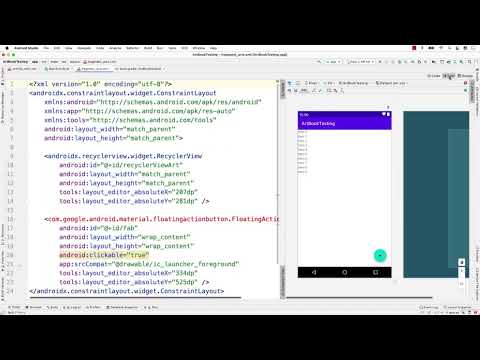
- A new layout named
fragment_artsis created to display saved art pieces. The naming convention allows for easy identification and organization within the project.
- The design includes a RecyclerView and a Floating Action Button (FAB). These components are essential for displaying art items and adding new entries, respectively.
Implementing RecyclerView
- The speaker explains how to set up the RecyclerView with an appropriate ID (
recyclerview_art) to differentiate it from other potential RecyclerViews in different fragments.
- Emphasis is placed on using a grid layout manager for displaying images fetched online, enhancing user experience through visual organization.
Adding Floating Action Button
- The FAB is introduced into the layout. While specific icons are not yet chosen, placeholders can be used until suitable images are available in the drawable folder.
- The speaker opts for an Android icon as a temporary representation for the FAB, demonstrating flexibility in design choices during development.
Choosing Layout Types
- A discussion on layout types reveals that while ConstraintLayout could work, CoordinatorLayout is preferred due to its better handling of floating action buttons' positioning.
- Transitioning from ConstraintLayout to CoordinatorLayout allows more straightforward placement of UI elements without needing explicit constraints initially.
Structuring Layout Hierarchy
- By wrapping RecyclerView inside ConstraintLayout within CoordinatorLayout, developers can manage constraints effectively while maintaining clean code structure.
- Setting zero constraints ensures that UI elements adapt responsively within their parent layouts, promoting better usability across different screen sizes.
Finalizing Layout Adjustments
- Additional adjustments include giving IDs to layouts for future reference and ensuring proper anchoring of views like FAB relative to other components in CoordinatorLayout.
How to Position a Floating Action Button in Android
Setting Up the Floating Action Button
- The speaker discusses options for positioning a floating action button (FAB), indicating that it should be placed at the bottom of the screen. However, initial attempts fail due to the absence of an anchor.
- To resolve this, the FAB is anchored to a RecyclerView by specifying its ID. This allows for more precise control over its position using gravity attributes like bottom and right.
- The speaker explains how different anchor gravities can be applied, such as left or end, demonstrating flexibility in positioning within the fragment layout.
Customizing the Floating Action Button
- The size of the FAB can be adjusted; options include auto, mini, and normal sizes. The speaker opts for 'normal' as it is generally preferred.
- Background customization is discussed, with suggestions for colors like green or black. Changing these attributes affects both appearance and user experience.