La guía definitiva de TIPOGRAFÍA para principiantes 🔥
Introduction to Typography
In this section, the speaker introduces the topic of typography and its importance in graphic design. They explain that typography is the art of teaching letters and studying their graphical representation to make written language effective.
The Definition and Purpose of Typography
- Typography is the art of teaching letters and studying their graphical representation for effective written communication.
- It involves representing letters graphically to create a visual element that is almost omnipresent in our daily lives.
- Typography can convey concepts or emotions through different styles, colors, and images.
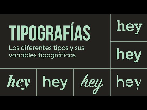
Types of Typography
Serif Fonts
- Serif fonts have small decorative strokes at the ends of characters' strokes.
- They are suitable for paragraphs or long texts as they contribute to readability by creating an imaginary line under the text.
Sans-serif Fonts
- Sans-serif fonts do not have decorative strokes at the ends of characters' strokes.
- They are often used for headlines, posters, and advertisements due to their modern, secure, neutral, and minimalist appearance.
Script Fonts
- Script fonts imitate handwriting or calligraphy with curved letterforms and ligatures.
- They add a human touch and a sense of closeness to designs.
Decorative Fonts
- Decorative fonts do not fit into any specific category but are known for their unique characteristics.
- They are considered fun, playful, and attention-grabbing but may sacrifice legibility.
Classification of Typography Based on Form
In this section, the speaker explains how typography can be classified based on its form. They discuss four main categories: serif fonts (roman), sans-serif fonts (grotesque), script fonts (handwritten), and decorative fonts (display).
Serif Fonts (Roman)
- Serif fonts have small decorative strokes at the ends of characters' strokes.
- They are considered traditional, serious, and refined due to their high contrast in stroke thickness.
Sans-serif Fonts (Grotesque)
- Sans-serif fonts do not have decorative strokes at the ends of characters' strokes.
- They are modern, secure, neutral, and minimalist in appearance.
Script Fonts (Handwritten)
- Script fonts imitate handwriting or calligraphy with curved letterforms and ligatures.
- They add a human touch and a sense of closeness to designs.
Decorative Fonts (Display)
- Decorative fonts have unique characteristics that don't fit into other categories.
- They are fun, playful, attention-grabbing but may sacrifice legibility.
Conclusion
The speaker concludes by highlighting the importance of typography in design and its ability to convey emotions and concepts. They emphasize that understanding different types of typography can help designers make informed choices for effective communication.
Understanding Decorative and Display Typography
In this section, the speaker discusses the use of decorative and display typography in design. They emphasize the importance of considering when to use these types of fonts and provide examples of decorative or display typefaces.
Decorative and Display Typography
- Decorative or display typefaces should be used carefully as they can convey a lack of care or disinterest in design.
- These typefaces are not suitable for paragraphs of text.
- Examples of decorative or display typefaces are provided.
Exploring Typeface Families
This section introduces the concept of a typeface family in graphic design. The speaker explains that a typeface family is a set of alphabetic characters with common characteristics in structure and style.
Typeface Families
- A typeface family is a collection of alphabetic characters with shared characteristics in structure and style.
- Typeface families originated with the creation of printing presses but have expanded due to digitalization.
- Examples such as Gotham, Futura, and Swift are mentioned as favorite typeface families.
- Members within a typeface family resemble each other but may have variations in weight, width, or inclination known as typographic variables.
Understanding Typographic Variables
In this section, the speaker delves deeper into typographic variables within a typeface family. They explain that these variables allow for visual hierarchy and meet different communication needs.
Typographic Variables
- Typographic variables refer to modifications in the morphology (shape) of typography within a typeface family.
- These variables act on stroke thickness, width, or inclination along the vertical axis.
- Visual hierarchy can be established using typographic variables in compositions.
- The first variable presented is weight (thickness), followed by width (proportion) and inclination (angle).
Exploring Typographic Variables in Depth
This section provides a more detailed explanation of each typographic variable and its impact on typography.
Weight (Thickness)
- The weight variable affects the stroke thickness of characters, altering the relationship between stroke width and empty spaces.
- Examples are given to demonstrate how weight influences typography.
This section explores the second typographic variable, width, which refers to modifications in the width of characters within a typeface.
Width (Proportion)
- The width variable directly affects the structure of characters by modifying their width.
- Condensed and expanded typefaces are examples of variations in width.
- It is important not to distort the scale of typefaces when using condensed or expanded versions.
This section focuses on the third typographic variable, inclination, which alters the angle of characters within a typeface.
Inclination
- The inclination variable modifies the vertical axis of characters, changing their structure and rhythm.
- The inclination angle can vary depending on the design but typically ranges from 8 to 16 degrees.
- Oblique and italic variations are discussed as examples of inclined typography.
Understanding Versalitas Typography
In this section, the speaker introduces versalitas typography, which maintains uppercase letters at the same height as lowercase letters. They explain that versalitas can be useful for aesthetic purposes.
Versalitas Typography
- Versalitas typography features alphabets where uppercase letters have the same height as lowercase letters.
- These typefaces can be beneficial for aesthetic purposes.
- Recognize versalitas typefaces by their endings in letters such as "s" or "c."
Tips for Working with Typographic Variables
This section provides tips for working with typographic variables and emphasizes the importance of selecting appropriate typefaces rather than digitally modifying them.
Tips for Working with Typographic Variables
- When needing bold, condensed, or italic typography, choose a font that already includes these typographic variables.
- Avoid using software to digitally modify typefaces by adding or removing bold or italics.
- Manipulating typefaces should be done carefully and respecting their original design.
Recommended Websites for Finding Typography
The speaker shares two recommended websites, MyFonts (paid) and Google Fonts (free), for finding typography. They also mention the possibility of discovering interesting websites from small typographers.
Recommended Websites for Finding Typography
- MyFonts is a paid website known among graphic designers.
- Google Fonts is a free website commonly used by designers.
- Small typographers' websites may offer unique and interesting typography options.
Conclusion and Additional Resources
The speaker concludes the video by acknowledging that there is much more to explore in the world of typography. They promise to provide additional resources in the video description as they discover new pages from small typographers.
Conclusion and Additional Resources
- Typography is a vast subject with many aspects to explore.
- Additional resources will be provided in the video description for further exploration of typography.
[s=761s] Introduction and Thank You
The speaker introduces themselves and expresses gratitude to the viewers for watching.
Introduction and Gratitude
- The speaker thanks the viewers for watching their videos on graphic design.
- They mention that more content will be coming soon.
- The section ends with a musical outro.
This section does not contain any significant information or insights.