como HACER un CARRUSEL de IMAGENES en HTML CSS y JAVASCRIPT 😱
How to Create an Image Carousel with HTML, CSS, and JavaScript
Introduction to the Tutorial
- The tutorial focuses on creating a responsive image carousel using HTML, CSS, and JavaScript.
- The presenter demonstrates how the slider adapts to mobile and desktop views.
Setting Up the Project
- A new folder named "slider" is created for the project files; users can name it as they prefer.
- An
index.htmlfile and astyles.cssfile are created within the folder.
- Basic HTML5 structure is established in
index.html, with a link to the CSS file included.
Opening Files in Browser
- The HTML file is opened in a web browser (default browser settings apply).
- Users are advised on how to open their HTML files based on their preferred browsers.
Using Live Server Extension
- For Visual Studio Code users, installing the "Live Server" extension is recommended for real-time updates without manual page refreshes.
- Instructions are provided for installing Live Server and opening it via right-clicking on the HTML file.
Integrating Swiper Library
- The tutorial will utilize version 9 of the Swiper library for easier carousel development.
- Both CSS and JavaScript files from Swiper will be linked in the project setup.
Preparing Images for Carousel
- Users are instructed to download images that will be used in the carousel; these images will be provided in a description link.
- Initial project files including libraries will also be available for download, allowing users to focus on coding within the body section of their HTML document.
Starting with Body Structure
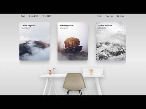
Creating a Web Layout with HTML and CSS
Building the Structure
- The tutorial begins by creating a
divelement with a class named "left" to structure the layout. An unordered list (ul) is introduced, starting with an item for a logo and simulating a date (e.g., January 2020).
- The instructor emphasizes that this is just an example; users can modify it as needed. JavaScript can be utilized to dynamically update the date.
- Another
divis created with a class "write", followed by another unordered list containing navigation links such as "Inicio" and "Servicios". This demonstrates how to simulate navigation in the layout.
Implementing the Carousel
- Moving on, the tutorial introduces creating a carousel using Swiper library classes like "swiper" and "swiper-container".
- A new
divfor slides is added, labeled as "swiper-slide". Inside this slide, anh3header and paragraph are included for text representation.
- Images are incorporated into each slide. The instructor mentions copying this structure multiple times (seven times in total), ensuring consistency across all slides.
Finalizing Image Setup
- Each image placeholder is set up sequentially from image one through image seven. Users are encouraged to pause the video if they need to verify class names or structures.
- A summary of the carousel setup is provided, reiterating that there should be seven images represented within their respective slides.
Styling with CSS
- After completing HTML structure, attention shifts to CSS styling. The instructor opens the styles file to reset default margins and paddings for cleaner design.
- Key CSS properties such as margin, padding, text decoration removal for links, and list style adjustments are discussed to enhance visual presentation.
- Background styling involves using gradients defined by RGBA values positioned at different percentages for aesthetic appeal.
CSS Development Tips and Techniques
Setting Up the Environment
- The speaker suggests pausing the video as needed while setting up a font from Frankie Golden on Medium, indicating that it will be used in the project.
- A point container is introduced with a maximum width of 1040 pixels, and margins are set to zero for top and bottom, while left and right margins are set to auto.
Enhancing Development Efficiency
- An extension for Visual Studio Code is recommended, which helps map HTML classes automatically, making it easier for developers to find and use them without manual searching.
- The speaker emphasizes that using this extension is optional but can significantly speed up development by simplifying class management.
Styling Elements
- Padding of 20 pixels is added around elements, with specific adjustments made for display properties using Flexbox to create a structured layout.
- The design approach focuses on desktop-first development before adapting for responsive layouts; initial styles include padding adjustments and text transformations.
Navigation Bar Design
- Styles are applied to list items (li), including padding settings and text color specifications. Text transformation ensures all items start with capital letters.
- Links within the navigation bar receive similar styling: size adjustments, color consistency, and text transformations to maintain uniformity across elements.
Content Layout Adjustments
- Transitioning into content styling, the speaker discusses implementing Swiper.js features. Initial image spacing is set at 40 pixels from the top.
- Background colors are defined along with shadow effects for images; dimensions such as height (420 pixels), width (295 pixels), and border radius (15 pixels) are specified.
Finalizing Image Presentation
- Positioning elements relatively allows absolute positioning of child components. Further adjustments ensure consistent sizing across images within sliders.
- Additional spacing techniques are discussed for titles within sections; padding values help prevent overlap with other content elements.
Responsive Design and JavaScript Implementation
Setting Up the Image and Layout
- The process begins with centering an image using CSS, adjusting its Z-index to ensure it appears above other elements. The image width is set to 800 pixels.
- Upon viewing in desktop mode, the image aligns correctly. The next step involves modifying responsive design aspects, allowing viewers to pause the video for reference.
Media Queries for Responsiveness
- A media query is introduced to apply styles responsively when screen resolution drops below 991 pixels. This ensures a better mobile view.
- Navigation spacing is adjusted to 30 pixels on all sides, while left navigation display is set to 'none' for a cleaner look.
Image Adjustments and Padding
- Additional padding of 70 pixels is added around certain elements for visual space. Images are set to take up 100% width of their containers, eliminating any white space.
- Further adjustments include setting padding of 30 pixels around images at the bottom, ensuring they adapt well within their container.
Finalizing CSS and Transitioning to JavaScript
- With CSS adjustments complete, attention shifts to JavaScript coding. A variable named 'swiper' is created as part of initializing a library for slider functionality.
- The swiper instance references main components and sets parameters such as slide preview count and spacing between slides.
Enhancing Slider Functionality
- Cursor settings are modified to show a hand icon when hovering over slides, enhancing user interaction experience.
- Breakpoints are established at 991 pixels; this allows different slider configurations based on screen size.
Conclusion of Example Setup