Statistics Lecture 2.2: Creating Frequency Distribution and Histograms
Introduction to Frequency Distributions
In this section, the instructor introduces the concept of frequency distributions and explains how to organize and summarize data using them.
Creating a Frequency Distribution
- A frequency distribution is a way to organize data by grouping values into classes and counting their frequencies.
- The simplest version of a frequency distribution involves listing values or classes along with their corresponding frequencies.
- For example, counting the number of people with different hair colors in a classroom.
- Classes represent groups or ranges of values, while frequencies indicate how often something occurs within each class.
Steps for Creating a Frequency Distribution
- Determine the number of classes based on the population being sampled. Too few or too many classes can hinder trend analysis.
- Calculate the class width by finding the difference between the highest and lowest values in the sample, divided by the number of classes.
Understanding Class Limits
- Lower class limit: The smallest value belonging to a class, indicating where that class starts.
- Upper class limit: The highest value belonging to a class, indicating where that class ends.
Timestamps are not available for all bullet points in this section.
Determining the Number of Classes and Class Width
In this section, the speaker explains how to determine the number of classes and class width for a frequency distribution.
Calculating the Number of Classes
- Divide the range (maximum value minus minimum value) by the desired number of classes.
- Example: Range = 44 - 18 = 26
- Round up to the nearest whole number to ensure enough room for all data points in each class.
Determining Class Width
- The class width is the difference between two consecutive lower class limits.
- Start with the minimum value as the first lower class limit.
- Add the rounded-up class width repeatedly to find subsequent lower class limits.
Creating a Frequency Distribution
- List the classes and their corresponding frequencies.
- Determine the starting point (usually the minimum value).
- Use the class width to create consecutive classes by adding it to each lower class limit.
Constructing a Frequency Distribution Table
This section focuses on constructing a frequency distribution table using age as an example.
Steps for Creating a Frequency Distribution Table
- Determine the number of classes and class width using previous calculations.
- Choose a starting point (usually the minimum value).
- Create consecutive classes by adding the rounded-up class width to each lower class limit.
- Tally up frequencies for each class based on data points falling within that range.
Reviewing and Finalizing Frequency Distribution Table
The speaker emphasizes reviewing and finalizing a frequency distribution table after tallying up frequencies.
Reviewing Class Limits and Frequencies
- Double-check that all data points have been correctly assigned to their respective classes.
- Ensure that there are no missing or overlapping values in any of the classes.
Finalizing Frequency Distribution Table
- Once the frequencies have been accurately tallied, the frequency distribution table is complete.
- The table should include the classes (with lower and upper class limits) and their corresponding frequencies.
Conclusion and Homework Assignment
The speaker concludes the lecture by summarizing key points and assigning homework.
Key Points
- Rounding up is necessary when determining the number of classes to ensure enough room for all data points.
- Class width is calculated as the difference between consecutive lower class limits.
- Creating a frequency distribution table involves determining class limits, tallying frequencies, and finalizing the table.
Homework Assignment
- Refer to the provided website for additional resources on constructing frequency distribution tables.
New Section
In this section, the instructor discusses frequency distributions and class width.
Class Width Calculation
- The class width is determined by taking the maximum value minus the minimum value of the sample and dividing it by the number of classes desired.
- Example: If there are 5 classes and the maximum value is 100 and the minimum value is 20, then the class width would be (100 - 20) / 5 = 16.
Lower Class Limit and Upper Class Limit
- The lower class limit is the smallest value in each class, while the upper class limit is the largest value in each class.
- To determine these limits, start with a starting spot (either the lowest value or something just below it) and add the class width to get subsequent lower and upper limits.
Class Midpoints
- The class midpoint is calculated as the average of the upper and lower class limits for each class.
- It represents the middle value within a given class.
Class Boundaries
- Class boundaries are used to separate classes without gaps on a histogram.
- They are calculated as averages between one upper class limit and the next lower class limit.
New Section
In this section, further details about finding midpoints, boundaries, and creating histograms are discussed.
Finding Midpoints
- The midpoint for each class can be found by taking half of the difference between its upper and lower limits.
- This provides a representative value for that particular range.
Finding Boundaries
- Class boundaries are used to separate classes without gaps on a histogram.
- They can be found by averaging an upper-class limit with a lower-class limit from adjacent classes.
Histograms
- Histograms are created using frequency distributions.
- They display data using bars of different heights to represent the frequency or count of values falling within each class.
- Class boundaries are used to determine the width and placement of the bars.
New Section
In this section, the instructor explains how to determine class width and create histograms based on given data.
Determining Class Width
- The class width is determined by dividing the range (maximum value minus minimum value) by the number of desired classes.
- If given a specific number of classes, divide the range by that number and round up if necessary.
Creating Histograms
- To create a histogram, start with a set of data and determine the appropriate number of classes and class width.
- Use class boundaries to separate classes without gaps.
- Construct bars on a graph where the height represents the frequency or count for each class.
The transcript does not provide timestamps for all sections.
New Section
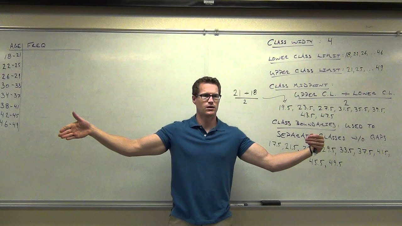
In this section, the speaker discusses the different numbers and definitions related to lower class limits, upper class limits, and class midpoints.
Identifying Lower Class Limits
- The first lower class limit is not mentioned.
- The next lower class limit is also not mentioned.
Number of Lower Class Limits
- There should be eight lower class limits for eight classes.
- The range of lower class limits should go from 22 to 26.
- It is suggested that one lower class limit could have been extended up to 46.
Upper Class Limits
- The first upper class limit is not mentioned.
- The range of upper class limits goes up to 49.
- There should be eight upper class limits in total.
Class Midpoints
- The speaker asks for the calculation of the class midpoint for the first class.
- It can be calculated by adding the upper and lower class limits and dividing by two.
- The result is 19.5.
New Section
In this section, the speaker discusses how to find the average or midpoint for each class using upper and lower class limits.
Finding Class Midpoints
- To find the midpoint for each class:
- Add together the upper and lower class limits.
- Divide by two to get the average or midpoint value.
Example Calculation
- For example, if we take an upper limit of 21 and a lower limit of 18:
- Adding them together gives us 39.
- Dividing by two gives us a midpoint value of 19.5.
New Section
In this section, the speaker explains how to find the midpoint for each subsequent class using a similar method as before.
Finding Class Midpoints (Continued)
- The speaker asks the audience to find the next midpoint without doing any math.
- By adding 4 to the previous midpoint, we can find the next midpoint.
- The sequence of midpoints is as follows: 19.5, 23.5, 27.5, 31.5.
New Section
In this section, the speaker continues discussing how to find class midpoints and introduces the concept of class boundaries.
Finding Class Midpoints (Continued)
- The next midpoint without doing any math is 35.5.
- The subsequent midpoints are not mentioned.
Class Boundaries
- Class boundaries are used to separate classes in a histogram.
- They are not used in computations but help visualize gaps between classes.
- Class boundaries are found by averaging or adding upper and lower class limits and dividing by two.
- For example, between upper limit 21 and lower limit 22, the boundary is 21.5.
New Section
In this section, the speaker explains how class boundaries are used solely for creating histograms.
Purpose of Class Boundaries
- Class boundaries are used to create histograms.
- They do not determine where numbers should be tallied up; that's what classes do.
- Their sole purpose is to visually separate classes in a histogram.
New Section
In this section, the speaker concludes the discussion on class boundaries and summarizes key points about lower class limits, upper class limits, class midpoints, and class boundaries.
Recap of Key Points
- There should be eight lower class limits, eight upper class limits, and eight class midpoints for eight classes.
- Lower and upper class limits define each individual class.
- Class midpoints are found by averaging the upper and lower class limits for each class.
- Class boundaries are used to visually separate classes in a histogram.
The transcript does not provide information on the remaining sections.
Class Boundaries and Slicing the Data
In this section, the speaker discusses how to use class boundaries to analyze data.
Using Class Boundaries for Math Operations
- Class boundaries can be used to perform mathematical operations on data.
- Examples include averaging two values, adding a constant value, or finding the midpoint between two values.
Slicing the Data with Class Boundaries
- Class boundaries are like slices of a loaf of bread that divide the data into different categories.
- Each slice represents a class interval.
- The number of class intervals is one more than the number of classes because there needs to be a starting point.
Understanding Decimal Values in Class Boundaries
- Decimal values in class boundaries may not always make sense when considering age as a whole number.
- For example, 17.5 may not be practical if ages are represented without decimals.
- However, decimal values can still be used to separate classes for organizational purposes.
Creating Frequency Distributions
This section focuses on creating frequency distributions based on age groups.
Starting with an Initial Class Boundary
- The first class boundary is determined by considering the range of data and selecting an appropriate starting point.
Excluding Decimal Values from Age Groups
- When using age as a variable, decimal values like 17.5 are excluded from specific age groups.
- This is because people typically represent their age as a whole number rather than including decimals.
Organizing Data with Frequency Distributions
- Frequency distributions help organize data by grouping individuals into specific age ranges.
- By counting the number of individuals in each group, patterns and trends can be identified.
Collecting Data for Frequency Distribution
This section explains how to collect data for creating frequency distributions based on age groups.
Gathering Data for Age Groups
- Individuals are asked to raise their hands if they fall within a specific age range.
- The number of individuals in each age group is recorded.
Counting the Number of People in Each Age Group
- The speaker asks for volunteers to count the number of people in each age group.
- The counts are used to determine the frequency for each class interval.
Interpreting Frequency Distributions
This section discusses how frequency distributions can reveal trends and patterns in data.
Identifying Trends and Patterns
- Frequency distributions help identify where the majority of individuals fall within the data.
- Most people tend to be concentrated around certain age ranges, while others may be scattered.
Visualizing Data with Frequency Distributions
- Frequency distributions provide a visual representation of data that makes it easier to observe trends and patterns.
- When dealing with large datasets, frequency distributions are particularly useful for organizing and analyzing information.
Relative Frequency Distributions
This section introduces relative frequency distributions as an extension of frequency distributions.
Understanding Relative Frequency
- Relative frequency compares the frequency of each class interval to the total number of data items collected.
- It provides a percentage value rather than an absolute count.
Creating a Relative Frequency Distribution
- To create a relative frequency distribution, divide the frequency by the total number of data items and multiply by 100%.
- This allows for comparisons between different class intervals based on their relative proportions.
New Section
This section discusses how to find the total number of items in a sample without manually counting each item. It introduces the concept of class frequency and its relation to the total count.
Finding the Total Count
- The total number of items in a sample can be found by adding up the frequencies of each class.
- Example: 25 + 10 + 4 + 2 + 4 + 4 = 43 (n)
Relating Class Frequency to Total Count
- The class count is related to the sum of all frequencies.
- This relationship can be represented using the Greek letter Sigma (∑).
- To create a percentage, divide the class frequency by the sum of all frequencies.
- Example: Frequency / Sum of Frequencies = Percentage
Calculating Percentages
- Use a calculator to divide the frequency by the total count.
- Example: 25 / 43 = 0.581 (rounded to three decimal places)
- Convert proportions into percentages by moving two decimal places to the right.
- Example: 0.581 becomes 58.1%
Reasonableness of Results
- In this example, it is reasonable that approximately 58% of the sample falls within a specific age range (18-21).
- Most people refers to more than half, which is above 50%.
New Section
This section covers rounding rules when calculating percentages for individual classes.
Rounding Percentages
- When dividing numbers, round correctly based on decimal places.
- Look at the digit immediately after the desired decimal place for rounding.
- If it is five or greater, round up; if it is less than five, leave it as is.
- Example: For a result like 0.233, round correctly to avoid errors in subsequent calculations.
Importance of Precision
- In this class, precise numbers are often used, sometimes up to the fourth or fifth decimal place.
- Rounding incorrectly can lead to significant errors when using the rounded number repeatedly in calculations.
New Section
This section emphasizes seeking help if struggling with the concepts and calculations discussed.
Seeking Assistance
- If having difficulty understanding or performing the calculations, it is encouraged to ask for help.
- The instructor is available to provide assistance and support during the learning process.
Relative Frequency Distributions
In this section, the speaker discusses relative frequency distributions and how they can be used to analyze data. They also explain the importance of checking if the relative frequencies add up to 100%.
Relative Frequency Distributions
- A relative frequency distribution compares the frequency of each category or class to the total number of observations.
- It is important to ensure that the relative frequencies add up to 100% as a way to check for errors in calculations.
- Due to rounding, there may be a small deviation from exactly 100%, but it should not be significant.
Cumulative Frequency Distributions
The speaker introduces cumulative frequency distributions and explains how they are calculated by adding up frequencies as you go along.
Cumulative Frequency Distributions
- A cumulative frequency distribution involves adding up frequencies as you progress through different classes or categories.
- It is similar to calculating a cumulative GPA, where each semester's GPA is combined with previous semesters' GPAs.
- The cumulative frequency at any point includes all previous frequencies.
- The cumulative frequency distribution ends with the total number of observations collected.
Graphical Representation of Data
The speaker emphasizes the use of graphs, such as pie charts and histograms, to visually represent data and aid in understanding.
Graphical Representation of Data
- Graphical representations like pie charts, histograms, and bar charts make data more visible and easier to comprehend than numerical values alone.
- Using graphs helps individuals grasp the concept of data more effectively.
- The speaker mentions that they will demonstrate how to create graphs in upcoming sections.
[t=0:52:59] Understanding Normal Data
The speaker introduces the concept of normal data, which follows a bell-shaped curve with a central point.
Understanding Normal Data
- Normal data refers to data that follows a symmetrical distribution, with values increasing up to a central point and then decreasing.
- The speaker clarifies that "normal" does not refer to something being average or typical in this context.
Timestamps are provided for each section as requested.
New Section
This section discusses normal distribution and introduces the concept of a histogram.
Understanding Normal Distribution
- Normal data follows a pattern where it rises to a peak and then falls, creating a bell-shaped curve.
- Normal distribution is characterized by a rise and fall in data.
- In contrast, the data being discussed does not follow a normal distribution.
Introducing Histograms
- A histogram is similar to a bar chart but with touching bars.
- The bars in a histogram represent classes or intervals of data.
- The horizontal axis represents the classes, either using midpoints or boundaries.
- The vertical axis represents the frequency or relative frequency of the data.
New Section
This section explains how to create histograms using class midpoints or boundaries.
Creating Histograms
- Class midpoints or boundaries are used on the horizontal axis.
- The choice between midpoints and boundaries depends on personal preference unless specified otherwise.
- The vertical axis represents frequency or relative frequency.
- Equidistant bars are created for each class interval.
New Section
This section demonstrates how to determine frequencies for each class interval and construct histograms using both class midpoints and boundaries.
Determining Frequencies
- For each class interval, count the number of data points falling within that range.
Constructing Histograms
Using Class Midpoints
- Determine the frequencies for each class interval based on the given data.
- Plot the frequencies as bars on the histogram using class midpoints on the horizontal axis.
Using Class Boundaries
- Determine the frequencies for each class interval based on the given data.
- Plot the frequencies as bars on the histogram using class boundaries on the horizontal axis.
New Section
This section highlights the advantages of using histograms to visualize data and compares them to normal distribution curves.
Advantages of Histograms
- Histograms provide a visual representation of data.
- They show the distribution pattern more clearly than numerical values.
- Histograms can reveal any significant drop-offs or deviations from a normal distribution curve.
Comparing Histograms to Normal Distribution Curves
- A normal distribution curve has smaller bars at the extremes and larger bars in the middle.
- The discussed data does not fit a normal distribution curve, as it shows a strong drop-off instead.
Histogram with Midpoints
The speaker discusses how to modify a basic histogram to include midpoints instead of boundaries.
Modifying the Histogram
- To include midpoints in the histogram, you simply erase the boundaries and replace them with the corresponding midpoints.
- The midpoints represent the best class intervals for your data.
- For example, if the first midpoint is 23.5, you would continue adding subsequent midpoints such as 7.5 and 35.5.
Relative Frequency Distribution
The speaker explains how to create a relative frequency distribution from a basic frequency distribution.
Creating a Relative Frequency Distribution
- A relative frequency distribution is similar to a standard frequency distribution but represents frequencies as percentages.
- Instead of absolute frequencies, you use relative frequencies or percentages to represent each class interval.
- The graph itself remains unchanged; only the information on it changes.
Classy Midpoint vs. Relative Frequency Distribution
The speaker compares classy midpoint histograms with relative frequency distributions.
Comparing Classy Midpoint and Relative Frequency Distributions
- Both classy midpoint histograms and relative frequency distributions can be used to represent data in a histogram format.
- The difference lies in how the data is represented - either using class intervals with midpoints or using percentages as relative frequencies.
- The choice between these two methods depends on personal preference or specific requirements.
Cumulative Frequency Distribution
The speaker introduces cumulative frequency distributions and explains how they are created.
Creating a Cumulative Frequency Distribution
- A cumulative frequency distribution involves plotting cumulative frequencies on a graph.
- You start by using the midpoints of each class interval and plot the cumulative frequency for each interval.
- The graph shows the accumulation of frequencies as you move through the class intervals.
Visualizing Cumulative Frequency Distribution
The speaker demonstrates how to create a cumulative frequency distribution graph.
Plotting Cumulative Frequencies
- Using the given data, you start with the first midpoint and plot the corresponding frequency.
- For example, if there are 25 people in the first class interval, you plot that value.
- Then, for each subsequent class interval, you add up the frequencies and plot them accordingly.
- The resulting graph shows where most of the growth occurs and provides insights into data distribution.
Recap and Understanding
The speaker summarizes the different types of histograms and distributions discussed.
Summary of Histogram Types
- Various types of histograms can be created, including basic frequency distributions, relative frequency distributions, and cumulative frequency distributions.
- Each type represents data in a different way but serves to visualize information effectively.
- It is important to understand these concepts to accurately represent data on graphs.