A Beginner's Guide to Graphing Data
A Beginner's Guide to Graphing Data
Introduction to Graphing
- Mr. Andersen introduces the topic of graphing data, highlighting common mistakes made by high school students due to a lack of practice in graphing as they progress through education.
- He emphasizes that while graphing is taught in elementary school, it is often overlooked in middle and high school, similar to reading skills.
Importance of Graphs
- Mr. Andersen uses Charles David Keeling's work on carbon dioxide levels as an example, illustrating how raw data can be incomprehensible without visual representation.
- The "Keeling curve" is introduced as a significant scientific graph that shows increasing carbon dioxide levels and its relation to global warming.
Types of Graphs
- Five major types of graphs are identified: line graphs, scatter plots, bar graphs, histograms, and pie charts.
- A pre-quiz is conducted where viewers identify different types of graphs presented visually.
Line Graph
- Line graphs are used for displaying changes over time; for instance, tracking U.S. trade in goods and services over specific dates.
Scatter Plot
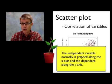
- Scatter plots correlate two sets of data; for example, measuring the duration between eruptions of Old Faithful against eruption length.
Bar Graph
- Bar graphs compare multiple groups; an example includes comparing incarceration rates across different countries or analyzing how light colors affect photosynthesis rates.
Histogram
- Histograms display data distribution; Mr. Andersen explains using tree heights as an example to show frequency within specified ranges.
Pie Chart
Understanding Graphs and Their Elements in Data Representation
Choosing the Right Type of Graph
- The speaker discusses selecting appropriate graphs for different data types, using an example from an ice cream store in Bozeman.
- For displaying monthly ice cream sales as a percentage of total sales, a pie chart is suggested.
- To analyze average temperatures over time, a line graph is recommended.
- A bar graph is suitable for comparing specific months' sales that start with the letter "J."
- A scatter plot is proposed to examine the correlation between ice cream sales and average high temperatures.
Key Components of a Scatter Plot
- The x-axis should represent temperature while the y-axis represents ice cream sales; both axes need proper labeling.
- Titles must be descriptive enough to convey what the graph illustrates, including details about data and context.
- A best fit line should be included to represent averages within the data without extending beyond it.
- It's important not to include zero on the axis if it's not relevant to the data being represented.
Common Errors in Graphing
- The speaker critiques a poorly constructed graph regarding fertilizer effects on plant growth, highlighting its lack of descriptive title and incorrect variable placement.
- Emphasizes that independent variables (fertilizer amount) should be on the x-axis while dependent variables (plant height) belong on the y-axis.
- Connecting dots in scatter plots is incorrect; they should remain unconnected to accurately reflect relationships between variables.
- Non-linear scaling errors are pointed out; equal spacing between grid lines is essential for clarity and accuracy.
- The importance of having multiple numbers on gridlines for better measurement representation is stressed.
Conclusion: Learning Resources