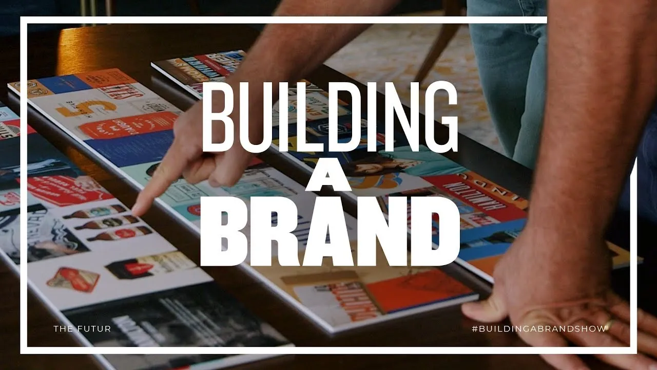
A Better Way to Present to Clients – Building A Brand, Ep. 5
New Section
In this section, the speaker discusses the open and honest communication environment within their team at Blind, a brand strategy design consultancy based in Santa Monica, California.
Team Communication Dynamics
- The team has created a space for honesty without fear of offending each other.
- There is a sense of comfort in expressing opinions openly within the team.
- Mention of playfully considering saying something to offend Ben just for the sake of it.
Rebranding Process at Blind
This part delves into Blind's role in helping diverse clients reach their target audience through design and provides insights into the rebranding process showcased in the series.
Behind-the-Scenes Look
- Blind uses design to assist clients in standing out in the marketplace.
- Viewers get an exclusive look at rebranding a company from inception to completion.
- The episode features designers using research and feedback to create style escapes for client presentation.
Client Presentation Preparation
This segment focuses on preparing style escapes for client presentation and highlights the nerves associated with showcasing work to clients for approval.
Client Presentation Readiness
- Designers refine style escapes based on research and feedback.
- Nervousness escalates as the presentation approaches.
- Deliberation on leaving one style escape behind due to similarity with others presented.
Crafting Style Escapes
Here, there is a detailed discussion on crafting distinct style escapes for client presentations and the importance of using descriptive language to engage clients effectively.
Crafting Unique Presentations
- Ensuring each option presented has significant contrast from others.
- Importance of using descriptors that resonate with clients' perceptions.
- Naming styles creatively to encapsulate brand essence effectively.
Final Presentation Decisions
This part covers finalizing presentation decisions, discussing potential client reactions, and strategizing for successful outcomes during presentations.
Decision-Making Process
- Finalizing presentation choices based on client preferences and expectations.
- Anticipating differing reactions from different stakeholders during presentations.
Detailed Design Directions
In this section, the speaker discusses four design directions curated to convey a specific vibe. These directions aim to capture different aspects of heritage and brand identity.
Ornate Heritage Direction
- This direction focuses on capturing the heritage aspect of the brand, incorporating flourishes and accents reminiscent of traditional Victorian ornamentation.
- Pops of color are added to traditional designs to freshen them up while maintaining a connection to natural materials in the brand's space.
- The logo design includes an ornate monogram, balancing ornate heritage with practicality for small spaces.
- Targeted towards beer enthusiasts, particularly beer snobs, this direction aims to appeal to a specific user persona.
Built to Last Direction
- This direction embodies authentic heritage through a blue-collar working-class lens, exuding quality Americana with a utilitarian feel.
- The color palette balances bold masculine colors with lighter tones for versatility and complements industrial-style elements.
- Utilizes badge-like shield shapes reflective of 40s and 50s Americana vibes for branding consistency.
Merit Badge Direction
- Tailored towards a more feminine audience without resorting to stereotypical pink hues, focusing on creating a welcoming environment for learning about beer.
The Design Process: Creating a Brand Identity
In this section, the discussion revolves around the concept of earning a badge and how it can be reflected in graphic language to convey specific traits and qualities of beer.
Earning a Badge Concept
- The badge symbolizes education and quality traits of beer.
- Observing clients' actions and words is crucial for consultants.
- Incorporating heritage into a new brand without an established history.
Exploring Heritage Through Design
This part delves into exploring heritage through design, focusing on hand-painted signs with an Americana vibe to infuse charm and craftsmanship into modern branding.
Embracing Heritage in Design
- Embracing the charm of hand-painted, handcrafted signs from the past.
- Modernizing retro heritage elements for a contemporary feel.
Craftsmanship and Personalization in Brand Identity
The conversation shifts towards craftsmanship, personalization, and representing these aspects in brand identity to capture warmth, humor, and quality associated with the brand.
Craftsmanship in Branding
- Highlighting handmade elements prevalent across the brand.
- Balancing hand-painted aesthetics with handcrafted designs for symmetry.
New Section
In this section, the speaker reflects on their past approach as a young designer and emphasizes the importance of involving clients in the creative process for successful outcomes.
Reflecting on Past Approaches
- The speaker used to believe they needed to have all the answers before presenting work.
- Emphasizes that involving clients in every step has been key to success.
- Clients prefer being part of the process rather than just receiving final solutions.
New Section
This segment focuses on initial reactions to design elements and highlights preferences based on visual appeal and specific features.
Initial Design Reactions
- Immediate reaction: One design seems busy but appreciates certain aspects like letter weight and shadows.
- Positive feedback on stamp-like elements in another design.
- Appreciation for hand-painted, hand-lettered aesthetics in designs.
New Section
Here, the discussion centers around selecting preferred design elements from different options based on visual appeal and unique features.
Selecting Preferred Elements
- Expresses preference for the top design overall but acknowledges liking elements from other designs.
- Appreciates how certain designs manage to look busy yet clean simultaneously.
- Would mix and match elements from different designs for an ideal outcome.
New Section
This part delves into color preferences, brand alignment considerations, and audience perception regarding design choices.
Color Preferences and Brand Alignment
- Likes specific colors in designs but questions if they align with brand identity effectively.
- Considers whether a design may appear too high-end for the target demographic.
- Evaluates which design best represents the brand's essence for its intended audience.
New Section
The conversation shifts towards detailed analysis of specific design aspects, focusing on engaging features that attract attention.
Detailed Design Analysis
- Appreciation for unique design elements that add intrigue and interest.
- Discusses ways to enhance certain aspects while maintaining a hand-crafted feel.
New Section
In this section, the speaker discusses the process of finding common ground with a colleague to implement ideas they both like.
Finding Common Ground
- The speaker reflects on the ease of implementing ideas that both parties like, emphasizing the importance of aligning preferences .
- They mention the conclusion reached in a previous meeting about selecting a direction and express satisfaction with staying within that chosen lane .
- The speaker appreciates considering all aspects discussed in prior meetings for implementation .
New Section
This part involves reflections on feedback received and reactions to a presentation.
Feedback Reflection
- Confidence is expressed in receiving positive feedback from Josh and Kristen regarding style escapes discussions .
- The team discusses receiving "Wow" reactions and overall positive impressions from the audience during the presentation .
- There is acknowledgment of not achieving perfection but satisfaction with how well certain ideas were received by the audience .
New Section
Here, there is an evaluation of audience reception and feedback analysis post-presentation.
Audience Reception Analysis
- Despite some disappointment in not achieving perfection, there is recognition of positive audience reception and quick identification of favored concepts by the viewers .
- The team notes that while some elements were well-received, others were immediately discarded as not meeting expectations, leading to clarity on future directions .
New Section
This segment focuses on analyzing audience responses to specific design elements presented.
Design Element Evaluation
- Positive remarks are made about how quickly certain design elements resonated with the audience, aiding in decision-making processes moving forward .
- Mention is made of identifying a third option combining various design aspects positively received by viewers, highlighting adaptability based on feedback received .
New Section
This part delves into next steps following audience feedback and decision-making processes.
Moving Forward
- With a direction chosen based on feedback analysis, designers will proceed with developing a logo—a critical phase in rebranding efforts requiring collaboration and adherence to standards .