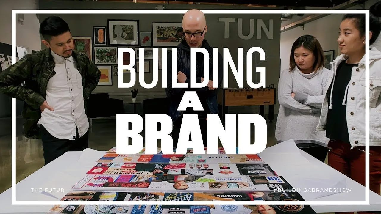
How to Narrow Down Your Design Ideas – Building A Brand, Ep. 4
Building a Brand Process Overview
The transcript provides insights into the brand-building process at Blind, a design consultancy in California. It delves into the stages of rebranding a company, focusing on creating style scapes to communicate brand direction effectively.
Designers' Initial Approaches
- Emily emphasizes ornamental flourishes and heritage for Hamilton's aspirational customer Kurt.
- Minh focuses on colorful stamps and woodcut illustrations for primary customer Jessica.
- Ben and Matthew critique Sang's maker culture approach, suggesting more emphasis on packaging details.
Style Scapes Creation
- Sang faces challenges with execution, needing to balance vision with practicality.
- Minh's design is critiqued as too feminine, lacking historical depth for broader appeal.
Refinement and Feedback
- Designers refine their concepts based on feedback to align with brand direction.
Detailed Design Feedback
In this section, the speaker provides detailed feedback on a design, focusing on color schemes, shapes, and overall coherence.
Color Scheme and Contrast
- The speaker expresses admiration for the colors used in the design.
- Points out an issue with contrast between certain elements and suggests adjustments for better harmony.
Visual Balance and Real Estate Usage
- Discusses the need for elements to work harder visually, especially when taking up significant space.
- Emphasizes the importance of visual balance and hierarchy in design compositions.
Unification of Colors and Application Across Media
- Talks about unifying colors and incorporating different textures for a cohesive look across various applications.
- Suggests adding pops of color to balance out the design palette effectively.
Interior Design Suggestions
This part focuses on interior design aspects, including textures, color pops, and thematic consistency.
Rustic Feel with Pops of Color
- Envisions an interior design theme that combines rustic elements with vibrant color accents.
Texture Integration and Wall Graphics
- Proposes incorporating textures like matte stainless steel into the background for added visual interest.
Style Escapes Evaluation
- Compares different style escapes based on their intensity levels and potential suitability for selection.
Design Feedback and Presentation
The team discusses design elements, color palettes, textures, and illustrations for a project. They provide feedback on wood textures, colors, and illustrations to enhance the overall aesthetic appeal.
Design Elements Discussion
- Concerns about the design being too white and feminine initially.
- Positive feedback on the use of bolder blue and orange colors to balance the design.
- Critique on wood texture resembling 90s IKEA furniture; suggests exploring sanded birch ply for a more industrial look.
- Preference for solid wood texture without visible grains; mixed feelings about the barrel illustration.
Style Scape Presentations
The team presents different style scapes based on retro inspiration. They discuss a unique hand-painted direction that may surprise the client with its boldness and unexpected elements.
Style Scape Exploration
- Introduction of a wild card style scape with retro influences not originally sought by clients.
- Appreciation for the hand-painted direction's boldness and solid color bands.
- Consideration to present this style scape last as it offers a distinct and unexpected option for the client.
Client Presentation Preparation
The team prepares to present their design directions to Josh and Kristen at the brewery. They deliberate on which options to include based on maker culture themes and masculine preferences.
Client Presentation Strategy
- Personal reflections on how it would feel if the client chooses their style scape.
- Discussion on whether all design directions should be presented or if some should be edited out due to similarities in maker culture themes.
Detailed Discussion on Design Direction
The team discusses the design direction for a client's project, focusing on standing out in the market and aligning with the brand vision.
Design Standing Out on Retail Shelves
- The hand-painted design direction is bold and distinctive, aiming to make the product stand out on retail shelves.
- Aligning the design with the overall brand vision is crucial for ensuring coherence and impact.
Presentation of Style Escapes
- Designers finalize style escapes for the client after days of work.
- Instead of a digital presentation, they opt to print out and personally present the style escapes in Rancho Cucamonga.
Founder's Involvement and Perspective
- Chris, the founder of Blind, usually remains hands-off but provides valuable input when needed.
- Seeking Chris' fresh perspective due to his impeccable taste and attention to detail.
Evaluation of Design Elements
The team evaluates various design elements for a brewery project, discussing typography, graphic patterns, and overall cohesion.
Typography Choices
- Discussion revolves around typography choices like typefaces, textures, and line work.
- Exploring how different typographic elements contribute to or detract from overall cohesion.
Graphic Patterns and Symbols
- Consideration of graphic patterns such as crests, chevrons, shield emblems.
- Evaluation of symbols like saws and lumberjack themes in relation to brand identity.
Extending Design Concepts
Delving into extending design concepts further by incorporating diverse elements for a comprehensive visual identity.
Texture Integration
- Emphasis on integrating textures like burlap bag feel into designs for tactile appeal.
- Utilizing line work variations to enhance visual interest in typographic elements.
Comprehensive Typography Mix
- Advocating for a mix of typography styles including script fonts alongside incentive typefaces.