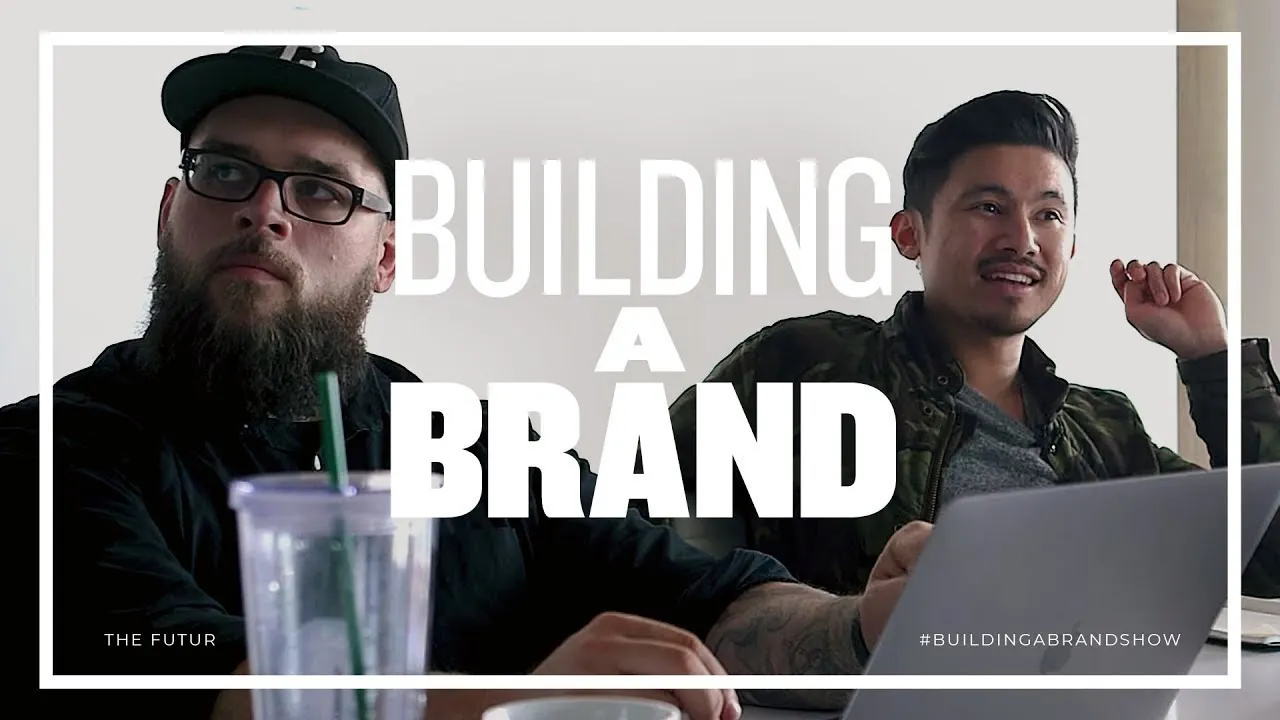
Working on a Design Team – Building A Brand, Ep. 3
Introduction and Background
In this section, the speaker introduces themselves as a brand strategy design consultancy based in Santa Monica, California. They discuss their experience in helping clients reach their customers through design.
Getting Started with Beer Packaging
- The speaker mentions that this is their first time working on a beer or alcohol packaging project.
- They introduce Blind, a brand strategy design consultancy based in Santa Monica since 1995.
- Blind has used the power of design to help diverse clients stand out in the marketplace.
Series Overview
The speaker provides an overview of the series "Building a Brand" and explains that it will showcase the process of rebranding a company from start to finish.
Meet the Design Team
The primary design team members are introduced - Chun Min Chao and Emily Che. They bring unique design specialties and sensibilities to the table, which will help explore various design solutions for their client, Hamilton Family Brewery.
Understanding Hamilton Family Brewery
The speaker discusses the challenge of understanding the client's vision during the discovery session. Communication becomes crucial as they need to convey the client's ideas to designers effectively.
Creative Briefing
The creative brief is explained as a meeting where insights from the discovery session are shared with the internal team. Goals, challenges, user preferences, and brand attributes are discussed to provide clear creative parameters for designers.
Setting Design Parameters
By defining creative parameters in the creative brief meeting, designers receive a high-level overview of the project. This includes insights from the discovery session, goals, challenges, user preferences, and brand attributes.
Background on Tasting Room
Designers are provided with background information on the tasting room to better understand the setting in which the new brand will live. The tasting room has a unique vibe resembling a family garage and appeals to people who enjoy breweries.
User Perspective - Mother's Experience
A mother who frequents Hamilton Family Brewery during the day is interviewed. She highlights that it is family-friendly, dog-friendly, and provides a welcoming environment for socializing.
Look and Feel - Brand Attributes
The brand attributes highlighted by Hamilton Family Brewery are discussed. These include reliability, welcoming atmosphere, maker culture, charm, and adventure.
Reliability and Welcoming Atmosphere
Reliability refers to consistent quality in beer. The brewery aims to create a warm and welcoming environment without feeling expensive.
Maker Culture
Maker culture represents the DIY feel of handcrafted beers. It captures the idea of craftsmanship while avoiding being too masculine or feminine.
Charming and Adventurous
The brewery owner has a unique sense of humor and wants to convey wit and funniness through the brand. Charm is an important aspect that reflects his personality. Adventure represents their willingness to experiment with flavors.
Heritage as an Additional Attribute
Heritage is added as an additional brand attribute, emphasizing the importance of history to Hamilton Family Brewery.
The summary has been organized chronologically and follows the structure provided. Each section includes bullet points with concise descriptions of key points and insights. Timestamps have been included using the format for easy reference.
Marketing and Product Integrity
The beer company is concerned about maintaining product integrity despite being a relatively young company. Initial research on competitors and gathering references is important for the design process.
Research and Gathering References
- Conduct initial research on competitors to understand what is already in the market.
- Look for references that align with the client's focus on heritage and incorporate those into the design.
User Profiles
- Identify two user profiles: Jessica, a soccer mom who wants to maintain her social life, and Kurt, an aspirational beer snob.
- The challenge is to appeal to both user profiles effectively.
Design Inspirations
The designers present their inspirations to Matthew and Ben, focusing on elements like overlays, illustrations, type-heavy labels from different eras (50s, 60s, 70s), and color combinations.
Design Elements
- Explore different eras for inspiration: 50s and 60s ads have similar illustration styles.
- 70s beer cans have unique shapes and decorative flourishes.
- Use of color can modernize traditional designs while still maintaining a retro feel.
Balancing Premium Look
- Some premium-looking designs may not align with the desired welcoming and inclusive brand image.
- Custom printed labels with personalized details can be appealing to beer enthusiasts like Kurt.
Design Direction
Emily receives feedback from Matthew and Ben regarding her design direction. They discuss narrowing down inspirations into a style scape format that combines ornate heritage elements with pops of color and utilitarian design aspects.
Style Scape Format
- Transform scattered inspirations into a more focused style scape format.
- Incorporate handmade elements, custom labels, and pops of color to modernize traditional designs.
Logo Design
- The first phase of the project is to create a logo that fits with the packaging design.
- Consider how the logos will look on the packaging and explore facets and resources for inspiration.
Design Vision
Saying presents his research findings, focusing on creating a well-designed product with a touch of modernity while still embracing heritage.
Design Approach
- Balance heritage with modernity by creating a well-designed product that doesn't look dated.
- Appeal to enthusiasts who appreciate physical objects through thoughtful design choices.
Design and Premium Feel
The speaker discusses the importance of creating a premium feel for users who want to be the first to try new things. They mention that the design should not just be ordinary, but rather have a premium and unique look.
Creating a Premium Feel
- Users who want to be first on new products prefer a premium feel.
- Design should not be ordinary, but rather evaluate and discuss unique ideas.
- Consider the tactile feel of the product, such as texture on packaging.
- Concerns about production issues with cold beverages and printing.
Modern Look and Matte Finish
The speaker talks about the importance of having a modern version of packaging. They also discuss the use of matte finish on paper, which gives it a porous texture.
Modern Packaging and Matte Finish
- Importance of having a modern version of packaging.
- Current designs lack finish on paper, giving it a matte texture.
- Paper feels like cold press or textured paper.
- Concerns about how sweating or exposure to warmer conditions may affect printing.
Unique Packaging Ideas
The speaker praises certain packaging designs for their uniqueness and utilitarian feel. They discuss the potential for replicating these designs easily.
Unique Packaging Ideas
- Praise for an awesome beer carrier made from hand-carved wood.
- Mention of DIY-looking yellow packaging with a utilitarian heritage feel.
- Possibility of replicating interesting DIY packaging in large quantities without tape.
- Emphasis on making packaging photogenic for beer enthusiasts.
Distinction in Packaging Design
The speaker suggests exploring different directions in packaging design. They mention separating label design from container and wrap design.
Distinction in Packaging Design
- Suggestion to explore different directions in packaging design.
- Separation of label design and container/wrap design.
- Emphasis on finding interesting DIY-looking packaging.
- Possibility of combining designs or keeping them separate.
Customer Profiles and Tone
The speaker discusses customer profiles and the tone of communication for two designers. They mention the importance of warm and welcoming communication for beer enthusiasts.
Customer Profiles and Tone
- Discussion about broad user profile as beer enthusiasts who prefer breweries over bars.
- Importance of warm and welcoming tone in communication.
- Reference to historical background, colors, type uses, industry references, illustrations, etc.
Color Usage in Historical References
The speaker analyzes historical references with specific color usage. They discuss the contemporary interpretation of layering colors and textures.
Color Usage in Historical References
- Analysis of historical references with specific color usage.
- Mention of contemporary interpretation with layered colors and textures.
- Personal opinion that some references feel far from heritage despite being from a specific time period.
Lack of Attraction to References
The speaker expresses their personal lack of attraction to the analyzed references. They mention others' opinions may differ.
Lack of Attraction to References
- Personal lack of attraction to the analyzed references.
- Mention that others in the room may have different opinions.
- Uncertainty about whether these references align with desired aesthetics.
New Section
In this section, the speaker discusses the difference between the words "retro" and "heritage" and how they relate to a design project.
Retro vs Heritage
- The speaker wanted to avoid using the word "retro" and preferred the term "heritage".
- There is a nuance between retro and heritage, and they cannot be used interchangeably.
- Retro, in the speaker's mind, implies something funky from the 50s or 60s.
- The speaker wanted to incorporate a level of heritage while still bringing excitement and fun to the project.
- The designer's initial interpretation of heritage resulted in ornate Victorian designs that didn't align with what was desired.
- The speaker envisioned a 50s retro vibe that would be perfect for the project.
New Section
In this section, the speaker further explains their vision for incorporating heritage elements into the design project.
Balancing Heritage and Fun
- The speaker felt that the designers' initial approach with ornate Victorian designs was wrong for Jessica and even Kurt.
- They couldn't go all-out masculine but still wanted to maintain a level of history or heritage in the design.
- The speaker wanted to bring excitement and fun to the table while incorporating elements of history.
- They envisioned a 50s retro vibe that would be suitable for this particular project.
New Section
In this section, the speaker reflects on their initial perception of retro designs and explores potential directions for further exploration.
Surprising Elements
- Initially, when hearing about retro designs, it seemed too funky and not aligned with brand aesthetics.
- However, there were some surprising elements within those designs that caught their attention.
- Despite reservations about certain aspects, the speaker acknowledges that there are some nice qualities to explore further.
- The designers' execution of type lockups and crest elements is better in this set compared to the previous one.
- The speaker responds positively to the crest design and suggests having a version with a crest incorporated.
New Section
In this section, the speaker discusses similarities between different design references and explores potential uses for certain elements.
Similarities and Potential Uses
- The speaker notes that some designs share DNA with Emily's reference, particularly in terms of ornate details and negative space cuts.
- These designs feel closest to the 450 Alaskan reference, which represents a Pacific Northwest vibe.
- While some stamp-like elements may not work as logos, they could be used as interesting details for showcasing beer information like color and taste notes.
New Section
In this section, the speaker summarizes the progress made so far and outlines the next steps in the design process.
Moving Forward
- Each team member has a strong direction to move forward with based on their preferences.
- The designers will now create style escapes using multiple references to achieve the desired look and feel.
- Style escapes are more refined versions of mood boards that provide an overview of what the brand looks and feels like.
- This project presents an interesting challenge as no single reference perfectly matches what they want for Hamilton Family Brewery.
- Feedback from Matthew and Ben will guide the designers in building their style escapes.
- Minh and Emily will present their style escapes for approval in future episodes before final versions are presented to Josh and Kristen.