Perfect Homepage Design Explained (in 15 minutes)
Introduction and Homepage Layout
In this section, the speaker introduces the topic of designing a perfect homepage layout. They mention that they will go through each section of the homepage and discuss important elements and tips for better design.
Navigation
- The navigation should be simple and familiar to users.
- Typically, the logo is placed on the top left and links or call-to-action buttons are placed on the top right.
- Avoid overwhelming users with too many links (3 to 4 links is recommended).
- Additional non-essential links can be placed further down or in the footer.
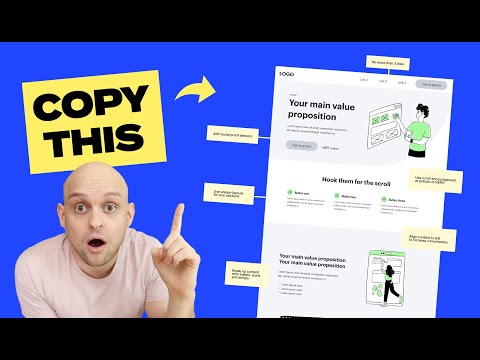
Hero Section
- The hero section is crucial as it is the first thing visitors see.
- It should convey what you do, why people need your services, and have a powerful call-to-action.
- Use a concise and engaging main header that describes your value proposition.
- Add supporting subtext to provide additional information without repeating what was said in the main header.
- Include a standout call-to-action button with high contrast colors.
- Consider adding social proof to build trust.
H1 Keyword Incorporation
- If necessary, use a small header area to incorporate your H1 keyword for SEO purposes when it cannot be included in the main header.
Importance of Hero Section
In this section, the speaker emphasizes the significance of the hero section on a website. They explain that it is often the only part visitors see before leaving, so it needs to effectively communicate what you do and why people should choose you.
Key Points:
- The hero section should clearly state what you do, why people need your services, and include a strong call-to-action.
- Many visitors may not scroll beyond this section, so make sure it captures their attention and encourages them to take action.
Designing the Hero Section
In this section, the speaker provides tips for designing an effective hero section on a website.
Main Header
- The main header should be short, powerful, and engaging.
- Look at successful company websites for examples of well-crafted headlines.
- Conduct A/B tests to determine which headlines convert better.
Supporting Subtext
- Use the supporting subtext to provide additional information about what you do and why people should choose you.
- Avoid repeating what was already mentioned in the main header.
Call-to-action Button
- Make sure the call-to-action button stands out with high contrast colors.
- Draw attention to it so that visitors are more likely to click on it.
Social Proof
- Consider adding some form of social proof near the call-to-action button.
- This can help build trust and encourage conversions.
H1 Keyword Incorporation
In this section, the speaker discusses incorporating H1 keywords into the design of a website's header area when necessary for SEO purposes.
Key Points:
- If it makes sense, incorporate your website's keyword into the main header.
- However, if there are cases where it doesn't fit naturally, use a smaller subheader above the main header to include your keyword for optimization and ranking purposes.
Importance of Visual Content on Websites
This section emphasizes the significance of using visual content, such as photos, images, videos, and animations, on websites to build trust and engage users.
Incorporating Visuals
- Adding actual photos or images of the service being performed can enhance trust.
- Videos are more effective than static images and can be clickable or embedded from platforms like Vimeo or YouTube.
- Animated images or videos provide a dynamic experience and should be considered despite requiring more time and investment.
Optimizing Above-the-Fold Space
- Utilize the space above the fold (visible area without scrolling) effectively.
- Avoid using the entire viewport for just the hero section; it may lead to users not realizing there is more content below.
- Encourage scrolling by showcasing a sneak peek or teaser of what's below the fold.
- Use an H2 header with an enticing message to hook users' interest.
Design Techniques for Scrolling
- Implement design elements that encourage scrolling:
- Arrows or Lottie animations pointing down.
- Mouse animations indicating scroll action.
- Create a flow between sections by adding curves or transitions for a seamless transition effect.
Exploring Creative Homepage Layouts
- Watch a video demonstrating 18 different hero section designs to inspire unique layouts.
- Incorporate these creative layouts into your own website design.
Three Bullet Section Layout
This section discusses the common three bullet section layout used on websites to convey information effectively. It provides tips on avoiding excessive content and suggests variations in layout for better visual appeal.
Three Bullet Section Layout
- The three bullet section layout is popular due to its ability to convey information concisely using icons, headers, and subtext.
- Be cautious not to overload with too much content, as users tend to avoid reading lengthy sections.
Layout Variation
- Avoid using a basic center-aligned layout for icons, headers, and subtext.
- Experiment with different variations to make your design stand out.
- Example: Place the icon on the left side of the header and position the subtext below for a visually appealing arrangement.
Breaking Up Content on Homepage
This section emphasizes the importance of breaking up content on the homepage to prevent overwhelming users with large blocks of text. It suggests strategies for creating engaging and easily digestible content.
Importance of Content Breakup
- Users have short attention spans; content needs to capture their attention quickly.
- Avoid presenting large blocks of text or paragraphs that discourage reading.
- Tick-tock culture demands immediate engagement within seconds.
Strategies for Breaking Up Content
- Utilize a left-right two-column layout as a basic approach.
- Explore other creative ways to break up content effectively.
- Use images, videos, and graphics to illustrate features and benefits.
- Incorporate visual elements that enhance user experience and engagement.
Using Visual Elements in Web Design
In this section, the speaker discusses the use of visual elements, such as emojis and bolded text, to enhance web design and make it more engaging for users.
Incorporating Visual Elements
- Utilize emojis to add color and break up text, similar to how they are used in text messages. This brings the text to life and makes it more visually appealing.
- Bold important text to draw attention and make it stand out.
- Use bullets with green check marks to create a visually engaging layout that is easier to read.
Importance of Breaking Up Content
- Avoid presenting large blocks of text without any visual breaks, as it can be overwhelming for users and discourage them from reading.
- Break up content into smaller sections using different layouts to make the website feel more custom.
- Check out a video on 11 unique section layouts for additional inspiration.
Displaying Social Proof
This section focuses on showcasing social proof through reviews and testimonials on a website.
Building Trust with Review Logos
- Include logos of well-known platforms underneath reviews or testimonials to build trust.
- Display five-star ratings as a symbol of trust.
- Mention the total number of reviews on different sites if available.
Gathering Reviews/Testimonials
- If you don't have many reviews or testimonials, start asking clients or users for feedback to build your reputation.
Example from Ahrefs
- Ahrefs provides a great example of effectively displaying trust through their review section.
Main Call-to-action (CTA)
This section discusses the importance of placing the main call-to-action prominently on the website after providing value proposition, social proof, product details, and testimonials.
Placing the CTA
- Position the main call-to-action after providing relevant information to encourage users to take action.
- Make the CTA compelling and enticing, avoiding dry or boring language.
FAQ Section
This section highlights the use of an FAQ section to address any remaining doubts or concerns users may have before taking action.
Utilizing a Dropdown Feature
- Use a dropdown feature for the FAQ section to save space and allow users to easily access specific questions and answers.
Footer Design
The speaker discusses organizing the footer section of a website for easy navigation rather than focusing on conversion.
Organizing the Footer
- There are no strict rules for footer layout as its primary purpose is navigation.
- Ensure that the footer is organized and easy to navigate.
New Section
This section provides an overview of what is needed to build a successful custom website.
Building a Successful Custom Website
- To be a successful designer and build successful websites, focus on the essentials outlined in this video.
Timestamps are not available for the remaining content of the transcript.