Tableau Complete Project End-to-End | Like I Do in My Real Projects
Tableau Project Overview
In this section, the speaker introduces a Tableau project that not only teaches Tableau skills but also shares insights on implementing projects in large companies like Mercedes-Benz.
Understanding the Phases of a Tableau Project
- The phases of a Tableau project are likened to building a house, starting with analyzing user requirements and progressing through planning, construction, and finishing touches.
- Key steps include understanding user requirements, deciding on chart types, creating mockups, preparing data sources, building charts, and formatting dashboards.
- Analyzing requirements involves understanding user needs, selecting appropriate chart types, creating dashboard mockups with colors chosen collaboratively.
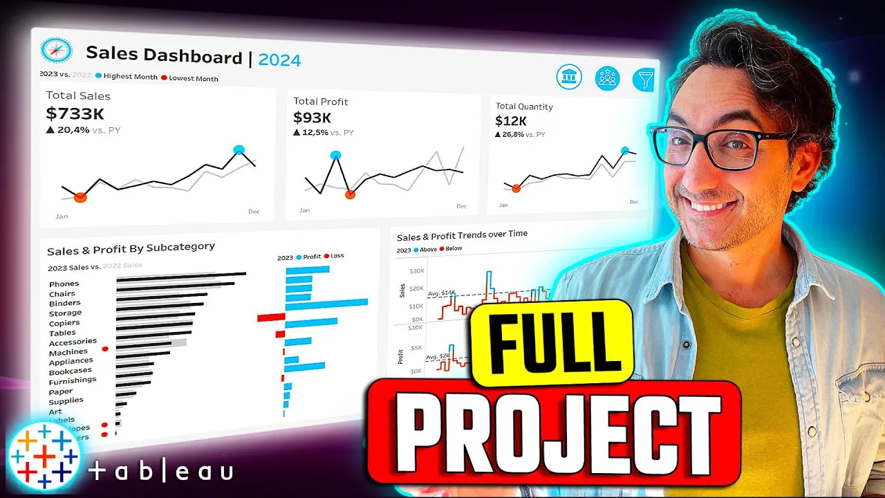
Building a Sales Dashboard in Tableau
This part focuses on constructing two dashboards using Tableau to analyze sales performance for managers, stakeholders, and customers.
Sales Dashboard Creation Process
- The objective is to build two dashboards: one for sales metrics overview and another for customer analysis.
- For the sales dashboard, the main goal is to provide an overview of sales metrics such as revenue and units sold.
Sales Dashboard Requirements Analysis
In this section, the speaker discusses the key requirements for analyzing year-over-year sales performance and determining the necessary elements for a sales dashboard.
Analyzing Year-Over-Year Sales Performance
- To analyze year-over-year sales performance, it involves comparing two years' data.
- "In order to analyze year-over-year sales performance...comparing two years together."
- Key requirements for the dashboard include providing an overview of total sales, profit, and quantity for the current year compared to the previous year.
- "To provide an overview...display a summary of total sales profit and quantity."
Types of Charts for Presentation
- The dashboard should display only current year and previous year sales data.
- "We don't have to present all the sales...only the sales of the current year."
- Bar charts are suggested for showing main metrics like total profit and quantity in large numbers.
- "Bans are very useful in order to show...total s profit quantity in big numbers."
Choosing Chart Types for Sales Trends
This part focuses on selecting appropriate chart types to present monthly sales trends, identify peak and low months, and highlight changes over time.
Presenting Sales Trends
- Data presentation should include total sales, profit, and quantity on a monthly basis.
- "Present the data of each qbi...on a monthly basis."
- Identifying months with highest and lowest sales is crucial.
- "Identify the months with highest...and lowest sales."
Chart Selection
- Line charts, specifically sparkline charts, are recommended to highlight maximum and minimum values effectively.
- "I'm going to go with line charts...use sparkline charts."
Product Subcategory Comparison Requirements
This segment delves into comparing different subcategories' sales from both current and previous years while incorporating profits into the comparison.
Comparing Subcategories
- Comparison involves evaluating subcategories' sales from current and previous years along with profits.
- "Compare the sales of different subcategories...include profits as well."
Chart Recommendations
- Bar in bar charts can be used due to having two values (current year & previous year).
- "Use bar in bar charts...to compare Sal with profit."
Weekly Sales Trends Analysis
The discussion centers around presenting weekly data trends for both sales and profits while highlighting above-average weeks.
Weekly Data Presentation
- Display weekly data trends for both current year's sales and profits.
- "Present weekly sale[s] & profit data...for change over time."
Highlighting Trends
- Emphasize weeks above/below average to understand trend patterns effectively using line charts.
- "Highlight weeks above & below average...using line chart[s]."
New Section
In this section, the speaker discusses the requirements for creating various charts in Tableau to present data effectively.
Creating Charts for Data Comparison
- Bar charts are used to compare subcategories between current and previous years.
- Profit is presented alongside sales using bar charts with plus and minus values.
- Weekly sales and profit trends are shown using line charts with separate sections for each metric to display average lines.
Dashboard Design Considerations
This part focuses on designing the dashboard layout and color schemes for effective data visualization.
Dashboard Filters and Color Schemes
- A filter icon is added to toggle visibility of filters due to space constraints.
- Choosing a color scheme early in the project is crucial; typically, four colors are used, with two basic colors based on the dashboard background.
Designing Dashboard Elements
The speaker elaborates on incorporating logos, dynamic features, and navigation buttons into the dashboard design.
Customizing Dashboard Appearance
- Basic color choices depend on background; additional colors can be user-defined or derived from logos.
- Logos can be added to dashboards along with dynamic elements like switching between different dashboards using buttons.
Preparing Data Source in Tableau
The process of setting up a data source in Tableau is explained step by step.
Data Source Setup
- Initiating Tableau Public as an empty canvas before connecting it to downloaded project data files.
- Connecting and understanding the data model by identifying dimensions (e.g., customer details) and facts (e.g., sales figures).
Data Overview and Modeling in Tableau
In this section, the speaker discusses the data structure, distinguishing between dimension and fact tables, and demonstrates how to model data in Tableau by connecting facts and dimensions.
Understanding Data Structure
- Dimension tables contain information like City, Country, Region.
- These are Dimension informations without events inside them.
- Fact tables include IDs (e.g., customer ID), dates (order dates), and measures (sales quantity).
- The presence of IDs, dates, and measures indicates a fact table with events.
- Products table consists of product-related details like Product ID and Category.
- This is classified as a dimension table.
Modeling Data in Tableau
- Start by adding facts (e.g., orders) to the data model followed by dimensions (e.g., customers).
- Establish relationships between tables based on common keys like Customer ID.
- Check relationship settings while adding dimensions like location and products to ensure correct connections.
- Verify key matches such as postal code to maintain accurate relationships.
Data Source Refinement in Tableau
The speaker focuses on refining the data source within Tableau by renaming tables for clarity and ensuring correct data types for fields.
Renaming Tables
- Rename the data source to enhance clarity; remove file extensions for neatness.
- Example: Change "Table Name.csv" to "Table Name."
Checking Data Types
- Verify data types for fields such as products (string type), locations (geographical info), customers, and orders.
- Ensure numbers have the number data type for continuous measures essential for visualization accuracy.
Understanding Data Before Visualization
Before creating visualizations, it's crucial to comprehend the dataset. The speaker demonstrates exploring categories, subcategories, segments, and identifying potential issues like duplicates.
Exploring Dataset
- Understand category values; identify hierarchy between dimensions like category and subcategory.
Detailed Data Analysis Process
In this section, the speaker discusses the initial steps of data analysis, focusing on understanding and exploring the dataset before proceeding to create visualizations.
Exploring Data Dimensions
- Understanding the importance of segments in data analysis.
- Identifying user segments versus product segments within the dataset.
- Emphasizing the significance of browsing data to comprehend business insights and engage with dashboard users effectively.
Creating Charts Based on Requirements
This part delves into building charts based on specific requirements provided, starting with total sales for the current year and previous year.
Total Sales Chart Creation
- Implementing requirements by creating charts that display total sales, profits, and quantity for the current and previous years.
- Addressing the need for dynamic selection of historical data through user-friendly dashboard features.
- Demonstrating how to filter data to show only sales for the current year using calculated fields.
Dynamic Calculation Using Parameters
The focus shifts towards making calculations dynamic by utilizing parameters in Tableau for enhanced interactivity.
Dynamic Year Selection
- Creating a new calculated field to display sales figures for the current year dynamically.
- Duplicating fields to showcase sales figures for the previous year as per project requirements.
Detailed Data Formatting Process
In this section, the speaker demonstrates how to format data by customizing display settings and linking parameters for dynamic user interaction.
Customizing Display Format
- Remove decimal places and set the display unit to none in the number custom format.
Setting Current Year Value
- Change the current value to the last year selected (2023) for parameter completion.
Dynamic Parameter Integration
The focus is on integrating user-selectable parameters into calculations for dynamic data representation.
User Interaction Enhancement
- Users can select the current year through a parameter but need linkage within calculations for changes to reflect in views.
Parameter Integration in Calculations
- Edit current year sales to include the selected parameter (Select year) for dynamic data presentation based on user input.
Dynamic Data Representation
Demonstrating how dynamic data selection impacts displayed information, ensuring user-driven customization.
Dynamic Data Display
- Changing the selected year reflects corresponding sales data dynamically, enhancing user control over displayed information.
Year-on-Year Comparison
Implementing a comparison between the current and previous years' sales figures using dynamic parameters.
Yearly Sales Comparison
- By adjusting parameters, users can compare sales figures between different years, showcasing dynamic data visualization capabilities.
Calculating Percentage Differences
Creating a calculated field to determine percentage differences between current and previous year sales figures.
Percentage Calculation
- A new calculated field computes percentage differences by subtracting and dividing current and previous year sales figures appropriately.
Information Formatting for Sales Data
In this section, the speaker discusses formatting sales data to enhance its visual presentation and clarity.
Formatting Total Sales
- Adjust total sales font to Tableau Book and size 14.
- Increase total sales font size to 22, make it bold, and add "versus previous year" text.
- Modify formatting of less relevant information back to Tableau Poke font and light gray color.
Enhancing Visual Appeal
- Change irrelevant information's format to Tableau Book with a light gray color.
- Format total sales by removing decimal numbers, using thousands as units, and adding a dollar sign as a prefix for professionalism.
Adding QPI Symbol for Sales Trends
This part focuses on incorporating an icon indicating whether sales are increasing or decreasing in the data visualization.
Adding QPI Symbol
- Customize number format to display up or down arrows based on positive or negative percentages.
- Ensure professional appearance with current year's total sales compared to the previous year using a quality performance indicator (QPI).
New Section
In this section, the speaker discusses how to show values based on sales data, highlighting the highest and lowest values.
Showing Values Based on Sales Data
- To display values based on sales data:
- If you are the highest value, show yourself; otherwise, search for the lowest value.
- Use window Min for the lowest value display.
New Section
This part focuses on testing calculations and visualizing sales data in a table format before moving to other visualizations.
Testing Calculations and Visualizing Data
- Steps to test calculations and visualize data:
- Validate calculations by checking in a table format before visualization.
- Verify calculated fields by examining sales data in a table view.
New Section
Here, the speaker demonstrates creating new charts using calculated fields and adjusting visualization settings for clarity.
Creating New Charts with Calculated Fields
- Creating new charts with calculated fields involves:
- Adding new measures like volume in Max sales to generate different chart types.
- Configuring visualization settings such as changing from automatic to circles for better clarity.
New Section
This segment covers enhancing spark lines by merging different chart types and addressing issues related to continuous fields.
Enhancing Spark Lines and Addressing Chart Issues
- Enhancing spark lines includes:
- Using Dual axis to merge circles with line charts for highlighting high and low values.
Go to the Dates and Abbreviate Months
In this section, the speaker demonstrates how to abbreviate months in a visualization to show only specific months for clarity.
Abbreviating Months
- The goal is to display only January and December on the visualization, removing other month information for simplicity.
- Adjusting the axis to start from January and end at December, showing only these two months on the chart.
- Removing null values from the visualization for a cleaner look.
Customizing Chart Colors
This part focuses on customizing colors in the chart to differentiate between current year sales and previous year sales effectively.
Customizing Colors
- Configuring custom colors for current year sales as very dark gray and previous year sales as light gray.
- Defining color codes for differentiating between current and previous year sales.
- Setting up colors for maximum clarity in distinguishing data points.
Enhancing Visualization with Tooltips
The speaker discusses improving tooltips in visualizations for better user understanding of data points.
Tooltip Enhancement
- Addressing tooltip readability by editing displayed information.
- Creating a customized tooltip with relevant details like sales figures and dates.
Detailed Configuration of Tool Tip in Data Visualization
In this section, the speaker demonstrates how to configure a tool tip in data visualization software by selecting values, adjusting formats, and organizing information effectively.
Configuring Current and Previous Year Values
- Select the current year value chosen by the user from parameters.
Converting Values to Dimensions
- Change selected values (current year and previous year) to dimensions instead of measures.
Setting Up Tool Tip Information
- Drag and drop necessary information (current sales, previous sales) into the tool tip box.
Configuring Tool Tip Content
- Customize tool tip content with current year, current sales figures, and month details.
Adding Sales Details to Tool Tip
- Include sales details for both current and previous years along with differences in sales.
Formatting Tool Tip for Improved Readability
This section focuses on enhancing the readability of the tool tip through formatting adjustments such as color changes, font modifications, and alignment improvements.
Adjusting Number Formats
- Modify number formats for current year and previous year values by reducing decimal points and removing thousand separators.
Ensuring Consistent Number Display
- Ensure uniformity in number display format across different sections of the tool tip for clarity.
Customizing Text Appearance
- Format text elements within the tool tip using light gray color for non-value text and dark gray color for key information.
Detailed Tutorial on Tool Tip Alignment
In this section, the speaker demonstrates how to adjust the alignment of numbers in a tooltip to enhance readability and visual appeal.
Adjusting Number Alignment in Tooltips
- To change number alignment, add a tab after the colon without any white spaces. Remove extra spaces by adding tabs for each number.
- Adding tabs automatically aligns numbers uniformly. Click "OK" to apply changes and test the alignment.
- After adjustment, all numbers start from the same position, enhancing the tooltip's appearance and readability.
Creating Multiple QPIs: Sales, Profit, Quantity
The speaker outlines steps for creating Quality Performance Indicators (QPIs) for sales, profit, and quantity metrics.
Building QPIs
- Replicate steps for creating QPI twice: once for profit and once for quantity. Create calculated fields for current year profits similar to total sales but with profit data.
- After completing calculations offline, ensure consistency across all QPI charts for profits, quantity, and sales metrics.
Building Subcategory Comparison Charts
This segment focuses on constructing comparison charts for subcategories based on current and previous year sales data.
Constructing Subcategory Comparison Charts
- Compare current vs. previous year sales by subcategory. Utilize bar charts to display sales data alongside separate charts for profit information.
- Verify data availability; minimal need for new calculated fields due to existing project data. Begin chart creation by selecting subcategories from products list.
- Add measures for previous year sales and current year sales as separate bars. Format bars using color options and size adjustments.
- Merge bars into a single chart using dual axes feature. Synchronize axes and hide unnecessary headers to refine chart appearance.
Sales Parameter Testing
In this section, the speaker demonstrates testing parameters by changing the year to 2022 and then back to 2023 to ensure functionality.
Testing Parameters
- The speaker showcases changing the year parameter to 2022 and confirms that all elements adjust accordingly.
- Reverting the year back to 2023 is shown as a validation step for parameter functionality.
Formatting Charts and Grids
This part focuses on formatting Spar charts, including hiding grid lines, adjusting borders, and cleaning up unnecessary elements.
Formatting Spar Charts
- Spar charts are highlighted as easier to work with compared to qbis.
- Steps for cleaning up the chart include hiding grid lines by accessing format options and removing unnecessary columns.
Axis and Font Formatting
The discussion centers on hiding axis headers and modifying font styles for better visualization.
Axis Customization
- Instructions are given on how to hide axis headers by right-clicking on them.
- Font adjustments involve making fonts darker, changing them to Tableau Medium, and setting font size at 10 for clarity.
Chart Sizing and Color Adjustment
This segment covers resizing chart components like sales bars, adjusting colors for better visual impact, and enhancing overall aesthetics.
Chart Enhancement
- Demonstrates resizing background elements like previous sales bars while making current year bars thinner.
- Color adjustments are made by changing subcategory font color to dark using Tableau Medium font style.
Color Coding Profit Data
The focus shifts towards color-coding profit data based on positive or negative values for improved data interpretation.
Color-Coding Strategy
- Utilizes measures to assign colors based on positive (turquoise) and negative (orange) values in profit data.
- By color-coding profits, it becomes easier to distinguish between positive and negative subcategories instantly.
Creating Quality Performance Indicator (QPI)
Introduces creating a QPI indicator through calculated fields indicating performance issues when current year sales are lower than previous years'.
QPI Creation Process
- A new calculated field named "qbi current year less than previous year" is created using conditions comparing current vs. previous sales figures.
- Icons such as circles are used as indicators of poor performance when conditions are met or remain empty if not fulfilled.
Ranking Data Visualization
Discusses sorting data visualization based on sales figures in descending order for a ranked view of subcategories' performance.
Data Ranking Process
- Subcategories are sorted based on current year sales figures in descending order to create a ranked visualization.
Detailed Tool Tip Configuration
In this section, the speaker demonstrates how to configure a tool tip in a data visualization dashboard to display current year profit, sales differences, and previous year sales.
Configuring Tool Tip Details
- The speaker modifies the tool tip to display the subcategory and current sales with the respective years.
- Details on configuring the previous year's sales in the tool tip are provided, ensuring proper formatting.
- Adding profit information to the tool tip for the current year is demonstrated, emphasizing correct tab placement.
- Final adjustments are made to ensure proper formatting before testing the tool tip functionality.
Enhancing Dashboard with Weekly Trends Chart
This part focuses on creating a line chart showcasing weekly trends for sales and profits, including average lines for both measures.
Building Weekly Trends Chart
- Introduction of creating a new worksheet named "Weekly Trends" to visualize weekly sales and profits trends.
- Utilizing order dates and converting them into weeks for plotting continuous lines in the chart.
- Splitting views into separate charts for sales and profits before adding reference lines for each measure.
Formatting Charts and Adding Colors
The speaker discusses cleaning up formatting elements within charts by removing unnecessary lines while retaining gridlines for clarity.
Cleaning Up Visual Elements
- Removing unnecessary lines from rows and columns while preserving gridlines for chart separation.
Formatting Axes and Numbers
In this section, the speaker focuses on formatting axes and numbers in a data visualization tool.
Formatting Axes
- Removing unnecessary titles to create more space.
- Simplifying axis titles to only "Sales" and "Profits."
Formatting Numbers
- Adjusting number formats by adding dollar signs for consistency.
- Ensuring uniformity in number display across different metrics.
Formatting Reference Lines
This part of the tutorial covers formatting reference lines in the visualization tool.
Changing Line Style
- Converting reference lines to dash style for visual distinction.
- Increasing opacity for better visibility.
- Darkening font color for emphasis.
Coloring and Highlighting Data Points
The discussion shifts towards coloring data points based on specific criteria to highlight above and below average values.
Creating Calculated Fields
- Developing calculated fields to differentiate values above and below averages.
- Using window functions to compare current year sales with average sales.
Implementing Color Coding
Implementing color coding based on calculated fields to visually represent data points above and below averages.
Assigning Colors
- Setting colors (e.g., blue for above average, orange for below) based on calculated field results.
- Editing color palettes for clarity and distinction between data points.
Adding Tooltips
Finalizing the visualization by incorporating tooltips for additional information display.
Tooltip Enhancement
- Including current year information in tooltips for detailed insights.
Sales Dashboard Creation Process
In this section, the speaker discusses the process of creating a sales dashboard, focusing on formatting elements and adding relevant information for analysis.
Renaming and Formatting Data Fields
- To update the sales field, rename it to "sales off" and insert the current year with a tab after the colon. Indicate whether values are above or below average.
- Add "the average" as a static term for clarity. Format it by removing bold and using light gray.
Testing Sales and Profit Data
- Test the updated fields by checking values against the average. Verify that figures above or below average are correctly identified.
- Confirm that profit data reflects accurately above or below average status when compared to the set benchmark.
Dashboard Structure Planning
This part covers planning the structure of a dashboard in Tableau, outlining container organization and layout design.
Container Structure Sketching
- Begin by structuring containers vertically within the main dashboard container.
- Arrange components such as titles, buttons, QB information side by side using horizontal containers within the vertical layout.
Incorporating Filters
- Integrate filters into a separate vertical container outside of the main structure using floating options for flexibility in display.
- Acknowledge that while planning is essential, adjustments may be necessary during actual dashboard creation to accommodate additional containers for organization.
Setting Up Dashboard Structure
In this section, the speaker explains how to set up the structure of a dashboard by adding containers and placeholders for elements.
Adding Planks for Elements Inside Main Container
- Add planks as placeholders inside the main container to hold elements.
- Introduce horizontal containers for titles within the main container.
Creating Horizontal Containers
- Drag and drop a horizontal container inside the main container.
- Customize the layout with blue coloring for borders and background.
- Rename containers appropriately for clarity.
Adding Content to Containers
- Place text elements such as "Sales Dashboard" inside horizontal containers.
- Ensure proper alignment of elements within the containers.
Adding Content to QBI Container
This part focuses on setting up a container specifically for QBI content by adding horizontal containers and organizing placeholders.
Setting Up QBI Container
- Create a new horizontal container beneath existing ones for QBIs.
- Customize coloring and naming conventions for clear identification.
Organizing Placeholder Elements
- Distribute placeholder elements evenly within the QBI container.
- Verify layout integrity by checking element placement.
Finalizing Dashboard Structure
The final steps involve refining the dashboard structure by removing unnecessary placeholders and ensuring content organization is optimal.
Refining Chart Container
- Add horizontal containers for charts below existing sections.
- Customize colors and labels to distinguish chart-related content.
Removing Unnecessary Elements
- Eliminate redundant placeholders from the layout.
Verifying Overall Layout
Detailed Formatting of Charts and Buttons
In this section, the speaker discusses the detailed formatting of charts and buttons within a dashboard interface.
Formatting Charts
- The speaker emphasizes the importance of aligning elements properly within containers for a visually appealing layout.
- Instructions are given on how to format the title by adding parameters, adjusting font size, and selecting appropriate colors.
- The process of configuring buttons within a horizontal container is explained to ensure uniform sizing and alignment.
- A demonstration is provided on moving buttons into a horizontal container for better organization and distribution.
- Checking the alignment and distribution of elements within containers to maintain consistency in design.
Customizing Buttons
- Ensuring even distribution of content within containers by utilizing options for consistent button sizing.
- Step-by-step guidance on editing button properties such as text, color, font size, and background to create distinct visual cues.
- Customizing individual buttons with specific titles like "Sales Dashboard" or "Customer Dashboard" along with appropriate styling choices.
- Adding tooltips to buttons for enhanced user interaction and providing clear navigation cues.
New Section
In this section, the speaker discusses adjusting the charts to fit the entire view and customizing legends for clarity.
Adjusting Chart Views
- The speaker ensures each chart fits the entire view by adjusting settings.
- Charts are optimized by making elements larger to utilize white space effectively.
Customizing Legends
- Legends are customized to provide clear information to users about current and previous years' data.
- A new legend sheet is created with text for current and previous year data.
New Section
This part focuses on customizing legend aesthetics for better visualization in Tableau.
Legend Customization
- The speaker starts by aligning text to the left and formatting the current year sales information.
- Bold formatting is applied selectively, ensuring clarity in distinguishing between current and previous year data.
New Section
Here, the discussion centers around refining legends and integrating them into the dashboard layout effectively.
Dashboard Integration
- The legend is named for identification within the dashboard structure.
- Due to layout constraints, a separate container is created for legends alongside charts for improved organization.
New Section
This segment delves into structuring containers within Tableau dashboards for optimal presentation of charts and legends.
Container Organization
- Vertical containers are utilized within horizontal ones to manage chart placement efficiently.
New Section
In this section, the speaker discusses chart layout and container organization in a data visualization tool.
Chart Layout and Container Organization
- The blue color represents profit, while orange indicates loss. Ensuring clarity in chart design is crucial.
- Utilizing vertical and horizontal containers to structure charts and text elements for effective presentation.
- Setting background colors for containers to create a cohesive visual unit within each chart.
- Renaming containers and adding text objects to convey specific information such as sales trends over time.
- Formatting titles, legends, and color schemes consistently across different chart components for coherence.
Formatting the Dashboard for Better User Experience
In this section, the speaker discusses the importance of formatting dashboards effectively to enhance user experience by adding spaces between charts and adjusting background colors.
Adjusting Background and Adding Spaces
- Removing borders and backgrounds from the main container enhances the dashboard's appearance.
- Introducing spaces between charts significantly improves user experience by providing visual balance and readability.
- Changing the background color of the entire dashboard to a light gray separates charts from the background, emphasizing spacing.
Enhancing Spacing Between Charts
- Increasing outer padding between objects helps create equal spacing around charts, contributing to a professional look.
- Committing to consistent spacing decisions throughout the dashboard is crucial for maintaining visual appeal and coherence.
Inner Padding for Improved Layout
- Adjusting inner padding within chart containers ensures content is appropriately spaced from borders, enhancing clarity and aesthetics.
Formatting the Dashboard Filters
In this section, the focus is on formatting dashboard filters to enhance user interactivity and data filtering capabilities.
Adding Filters to Worksheets
- Adding a margin of seven units to charts for better spacing.
- Formatting all charts with necessary filters based on product and location information requirements.
- Applying filters such as category for product information and country for location information across all worksheets.
Building Filter Containers
This part delves into constructing filter containers within the dashboard layout for improved data filtering functionality.
Constructing Filter Container
- Revealing the hidden filter container by adjusting settings.
- Customizing the filter container layout by removing unnecessary elements and focusing on essential parameters.
- Configuring filters within the container by selecting relevant categories, subcategories, regions, states, and cities.
Enhancing Filter Functionality
This segment emphasizes enhancing filter usability through dropdown menus and multiple value selections.
Improving Filter Structure
- Enabling multiple value dropdown selection for categories, regions, states, and cities to optimize space utilization.
- Discussing potential variations in filter presentation based on user preferences and importance of specific filters.
New Section
In this section, the speaker demonstrates how to format and customize elements in Tableau to enhance the visual appeal of the dashboard.
Formatting and Customization
- The speaker formats text elements by adjusting spacing, selecting colors from history for consistency, and aligning them in the middle.
- Adding spaces between groups of filters by inserting blank elements strategically for better organization.
- Controlling spacing between different sections by adjusting the size and height of blank elements within the layout.
- Introducing a title "Filters" at the top of the dashboard, customizing it with bold font, specific size (14), white color, and center alignment.
- Enhancing spacing around the title using a blank element to control space between the border and text.
New Section
This part focuses on positioning containers accurately within the dashboard layout for a professional look.
Positioning Containers
- Understanding and marking borders of main containers by adding visible borders through layout settings.
- Aligning containers precisely with borders by adjusting Y position to zero and manually positioning for bottom and right sides.
- Ensuring accurate placement by resizing containers as needed before proceeding to add inner padding for a polished appearance.
New Section
This segment covers refining container formatting with inner padding adjustments for improved user experience.
Refining Container Formatting
- Applying inner padding to containers to create space between content and edges, enhancing usability for users interacting with filters.
- Adjusting inner padding values like 10 to ensure content does not start immediately at container borders, facilitating easier selection.
New Section
Here, testing functionalities such as filtering data based on user interactions within charts is discussed.
Testing Interactivity
- Demonstrating data filtering capabilities by changing filter criteria like year (e.g., 2022 or 2023), observing real-time updates across linked charts.
Interactivity and Dashboard Customization
In this section, the speaker discusses adding interactivity aspects to a dashboard, including icons for filters and closing containers.
Adding Icons for Interactivity
- Five icons are available in the project folder for customization.
- Configuring options for when items are shown or hidden within the dashboard.
- Selecting icons like filter and close container to enhance user interaction.
- Demonstrating how selected icons affect container visibility in presentation mode.
- Adding tooltips for user guidance on mouse hover actions.
Logo Placement and Layout Adjustment
This part focuses on incorporating a logo into the dashboard layout and making adjustments for visual alignment.
Logo Integration and Layout Refinement
- Placing the logo before the title element in the dashboard structure.
- Adjusting size and position of elements to enhance visual appeal.
- Addressing alignment issues by testing layout adjustments with borders.
- Fine-tuning padding settings to ensure proper alignment of elements.
Icon Customization and Container Management
The speaker elaborates on customizing icons for different dashboard sections and managing them within containers effectively.
Customizing Icons and Container Organization
- Replacing text buttons with image icons for sales, customers, and filters sections.
- Consolidating multiple icons into one container for streamlined access.
New Section
In this section, the speaker demonstrates adjusting elements on a dashboard to achieve the desired layout and appearance.
Adjusting Elements on the Dashboard
- The speaker moves elements precisely to the border for correct placement.
- After adjustments, the dashboard looks visually appealing with perfect alignment.
- Removing unnecessary borders from containers enhances the overall look of the dashboard.
- Testing the container within filters ensures functionality and appearance consistency.
Customer Distribution Analysis
In this section, the speaker discusses creating a customer distribution analysis by utilizing LOD expressions to calculate the count of customers and orders.
Creating Customer Distribution Analysis
- Using LOD Expressions for Calculations
- Create a new sheet named "Customer Distribution."
- Utilize LOD expressions, specifically the fixed function, to generate counts for customers and orders.
- Converting Orders to Pens with Calculated Fields
- Create a calculated field to determine the number of orders per customer for the current year.
- Use the fixed function from LOD expressions and define dimensions accordingly.
- Aggregating Order Data
- Define dimensions using fixed functions for current year customers.
- Aggregate data by counting distinct orders placed in the current year.
Testing and Visualization
- Testing Calculated Field Results
- Convert measure into a dimension for discrete values suitable for histograms.
- Test values by creating a new sheet to visualize customer order data.
- Validating Calculated Field Data
- Examine individual customer order data using calculated fields.
- Verify that only current year orders are counted accurately.
Histogram Formatting and Customization
This segment focuses on formatting and customizing histograms to enhance visualization quality and user understanding.
Histogram Customization
- Adding Customers to Histogram Bars
- Count distinct customers for the current year in histogram bars.
- Formatting Histogram Appearance
- Remove grid lines for cleaner visuals.
- Enhance readability by adjusting font styles and colors.
- Applying Color Schemes and Borders
- Customize bar colors using control scroll options.
- Add borders to histogram bars for visual distinction.
Labeling and Finalizing Histogram
- Including Customer Labels in Histogram
- Display customer names as labels on histogram bars.
- Testing Histogram Functionality
- Validate histogram functionality by changing parameters (e.g., selecting different years).
Detailed Data Analysis Process
In this section, the speaker demonstrates a detailed data analysis process using a specific tool.
Setting Up Data Filters and Aggregations
- Applying filters to customer names and switching to the top tab.
- Selecting the top 10 customers by profit with sum as the aggregation method.
Formatting and Sorting Data
- Changing number format to display whole numbers with a dollar sign.
- Sorting the list by profit in descending order for ranking.
Adding Rankings and Additional Information
- Adding rankings using the index function for customers based on profit.
- Including sales for the current year and counting distinct orders placed by customers.
Enhancing Visualization Appearance
This part focuses on enhancing the visual appearance of charts through formatting options.
Adjusting Lines, Grid, and Background Color
- Removing grid lines between measures and dimensions for clarity.
- Eliminating gray background color by adjusting row banding size.
Customizing Fonts and Colors
- Formatting index field with a prefix for ranking display.
- Modifying font colors to enhance readability across different fields.
Building Customer Dashboard
The speaker discusses creating a customer dashboard based on an existing structure.
Duplicating Dashboards and Renaming
- Duplicating sales dashboard to create a new customer dashboard structure efficiently.
Updating Charts and Titles
- Replacing existing charts with new ones tailored for customer analysis.
Orders and Dashboard Setup
In this section, the focus is on setting up orders and hiding unnecessary containers in the dashboard.
Setting Up Orders
- To hide a container, right-click on the icon and select "hide."
- Remove old QBIs from the dashboard to make space for new ones.
Histogram Chart and Customer Distribution
This part covers adding a histogram chart, adjusting legends, and changing titles for customer distribution visualization.
Adding Histogram Chart
- Drag and drop the histogram chart below the legend.
- Remove old charts and unnecessary legends.
Customizing Customer Distribution
- Change the title to "Customer Distribution by Number of Orders."
Formatting Dashboard Layout
This segment focuses on ensuring proper alignment and formatting within the dashboard layout.
Ensuring Proper Alignment
- Check that all elements fit well within the entire view.
- Format each QBI with a white background for consistency.
Spacing Adjustment Between Charts
Adjusting spacing between charts to enhance visual appeal and coherence in the dashboard.
Spacing Adjustment
- Maintain a consistent spacing of 20 between each chart as agreed upon earlier.
- Set outer padding to 10 with zero top padding; inner padding remains at seven for all charts.
Custom Field Names and Table Formatting
Creating custom field names for better clarity in table visualization.
Custom Field Names Creation
- Customize field names such as rank, last order date, profit, sales, and number of orders for improved readability.
Table Formatting
- Hide original table titles to streamline visual presentation.
Dashboard Interactivity and Icon Navigation
In this section, the speaker demonstrates how to add interactivity to charts in a dashboard and customize icons for easy navigation.
Adding Interactivity to Charts
- The speaker guides on making charts interactive by selecting the histogram as a filter, allowing users to select data points and observe real-time changes.
- Demonstrates adding interactivity to the top list chart by making it a filter, enabling quick analysis for selected customers.
Customizing Icons for Navigation
- Explains customizing icons for navigation within dashboards, ensuring ease of movement between different sections.
- Shows selecting an active icon for the customer dashboard, visually indicating the current location within the dashboard system.
- Illustrates changing icons for sales dashboards to differentiate between active and inactive states, enhancing user experience.
Testing and Completion
- Confirms completion of dashboard setup with functional icons for seamless navigation between customer and sales dashboards.
- Emphasizes user-friendly design with clickable icons instead of tab switching, concluding successful project completion meeting all requirements.
Project Implementation Best Practices
The speaker shares recommendations on implementing Tableau projects efficiently from planning to delivery.
Efficient Project Implementation
- Advises against rushing projects without a clear plan, emphasizing step-by-step execution for delivering clean work effectively.
Engagement and Support
- Encourages audience engagement through likes, comments, and support to boost channel visibility and algorithm performance.