Designing A Beautiful Beer Can – Building A Brand, Ep. 9
New Section
The discussion revolves around concerns regarding production, responsibility to voice concerns, and the importance of maintaining transparency in business operations.
Concerns about Production
- Expressing concerns about production but feeling hesitant due to time constraints.
- Feeling a responsibility to voice concerns despite potential challenges.
- Emphasizing the importance of not having a guilty conscience in business dealings.
Brand Strategy Consultancy Introduction
Introduction to Blind, a brand strategy design consultancy based in Santa Monica, California, highlighting their expertise in using design to assist clients in reaching their target audience effectively.
Blind: Brand Strategy Design Consultancy
- Established in 1995, Blind focuses on leveraging design to help clients stand out in the marketplace.
- Providing insights into the process of rebranding a company from inception to completion.
Rebranding Process Overview
Recap of the previous episode where Jun worked on creating a website for Hamilton Family Brewery and transitioning towards packaging design for their new cans.
Rebranding Process Recap
- Summary of Jun's work on developing a website for Hamilton Family Brewery using Webflow.
- Transitioning Jun's focus towards packaging design challenges for Hamilton's new cans as they aim to enter retail markets.
User Profiles and Packaging Challenges
Discussion on identifying user profiles and addressing packaging challenges faced by Hamilton Family Brewery during their rebranding process.
User Profiles and Packaging Challenges
- Identifying primary user profiles (Jessica Torres and Kurt McLeod) to guide the rebrand process effectively.
- Addressing challenges related to communicating brand identity through packaging for wider distribution beyond the tasting room setting.
Importance of Packaging Design
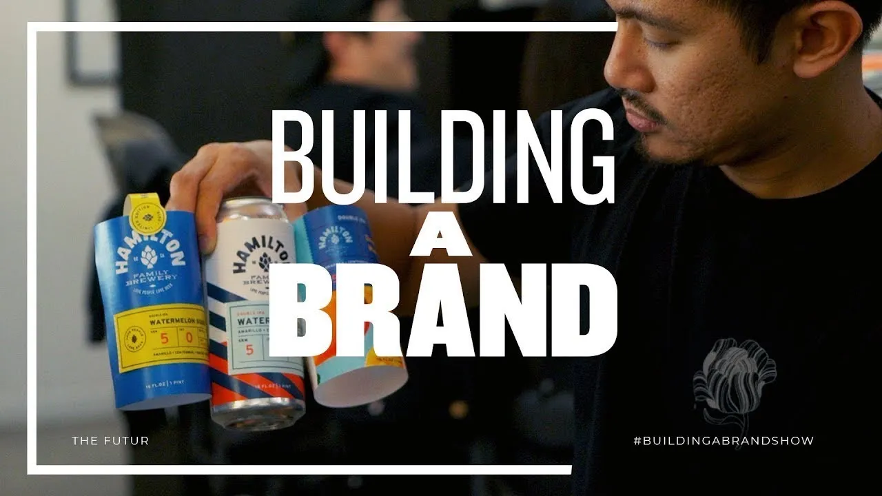
Emphasizing the critical role of packaging design in conveying brand identity, attracting customers, and driving sales within competitive markets.
Significance of Packaging Design
- Highlighting how packaging plays a crucial role in influencing consumer decisions, especially in industries like alcohol where visual appeal is paramount.
Initial Brand Style Exploration
In this section, the team delves into the initial brand style exploration, focusing on creating mock-ups to find a suitable starting point for the brand's visual identity.
Exploring Mock-ups and Initial Impressions
- June creates numerous mock-ups to guide the team in finding a starting point for the brand's visual identity.
- Evaluating different design iterations, discussing elements that stand out or lack connectivity with the brand's essence.
- Discussing color combinations and logo variations to enhance fun and ensure easy identification of flavors.
Packaging Design Refinement
This segment highlights Jun's process of refining packaging options for presentation to clients, emphasizing the importance of getting it right as packaging serves as a crucial touchpoint with customers.
Packaging Refinement Process
- Emphasizing constant refinement in packaging design through abstract concepts and typography exploration.
- Stressing the significance of packaging as a vital connection point with customers, ensuring alignment with brand essence.
Label Design Evaluation
The team evaluates label designs, focusing on standing out on shelves while aligning with brand identity and customer perception.
Critique and Feedback on Label Designs
- Expressing concerns about certain label designs appearing too juvenile or disconnected from the brand image.
- Discussing design elements that may not resonate well with target consumers, such as candy cane backgrounds or overly playful aesthetics.
Can Label Alignment Challenges
Addressing challenges related to aligning labels on cans effectively to maintain consistency and visual appeal.
Can Label Alignment Issues
- Highlighting difficulties in aligning labels due to can rolling during application processes.
- Exploring various printing methods for labels and potential solutions to ensure precise alignment on cans.
Final Packaging Concept Presentation
Presenting a refined packaging concept that balances heritage elements with modern appeal for client approval.
Presentation of Refined Packaging Concept
- Showcasing a balanced design featuring colorful labels hinting at flavors while maintaining a standard can appearance.
Designing Beer Labels
In this section, the team discusses the design elements of beer labels, focusing on placement, branding, and visual appeal.
Beer Label Design
- The beer information was placed above the Hamilton logo to ensure visibility on retailer shelves where part of the shelf may cover the bottom of the beer. This positioning aims for clear identification for buyers.
- Emphasizing "Luck and Will" on the beer label was a deliberate choice to enhance branding and create a unique experience for consumers beyond just taste. This decision aimed to resonate with customers who might not have a tasting experience.
- Incorporating a yellow stamp for limited edition or seasonal releases adds visual interest and differentiation within the brand's lineup. It allows for easy recognition of core brands versus special releases like barrel-aged beers with distinct colors such as gold.
Feedback and Execution Challenges
- Presenting the label design to stakeholders received positive feedback; however, transitioning from mock-up to final execution involves working with vendors chosen by Josh. Potential challenges lie in various handoffs during production that could lead to discrepancies or errors in printing.
- Obtaining press proofs from printers is crucial but can add time and cost; digital proofs present challenges due to color translation issues related to transparency and spot UV effects. Careful review of digital proofs is necessary to align with the intended design before final production.
Clarifying Artwork Details
This section delves into clarifying specific details in artwork proofs, addressing discrepancies between design intent and execution.
Artwork Clarification
- Noticing discrepancies in proof details, Matthew suggests discussing knockouts with vendors to ensure alignment on design elements like metallic colors or outlines on specific areas of the label artwork. A call is planned to clarify these aspects further.
Meeting with Josh and Kristen
In this section, Matthew and Ben visit Rancho Cucamonga to meet with Josh and Kristen. They discuss the corrected files, printer details, and upcoming plans for the brewery.
Corrected Files and Printer Details
- The files have been corrected after an error was identified.
- All files have been corrected.
- Matthew and Ben are now at the printer's location.
- They are at the printer's place in Rancho Cucamonga.
Introduction to New Designs
- A new version of the can design is showcased.
- Introduction to the first version of the new can design.
- The subtle yet standout features of the design are appreciated.
- The design is praised for its subtlety and uniqueness.
Enhanced Branding Strategies
This part focuses on branding strategies, including decisions on printing cans versus wraps, packaging formats for smaller orders, and maintaining brand consistency.
Branding Decisions
- Initial concerns about printing cans versus wraps are discussed.
- Concerns about printing cans instead of wraps are addressed.
- Strategies for smaller orders to maintain brand consistency are highlighted.
- Discussion on maintaining brand consistency with smaller orders.
Innovative Packaging Solutions
This segment delves into innovative packaging solutions such as coasters with can information, transitioning from wood boxes to tulip glasses for tasting flights, and challenges faced in providing detailed beer information.
Packaging Innovations
- Introduction of coasters with can information matching beer labels.
- Coasters displaying can information introduced.
- Transition from wood boxes to tulip glasses for tasting flights explained.
- Shift from wood boxes to tulip glasses detailed.
Consistent Brand Representation
Here, discussions revolve around consistent brand representation through stickers on crowlers, matching branding elements across products, and attention to detail in printing materials.
Brand Consistency
- Stickers on crowlers for consistent brand representation discussed.
- Use of stickers on crowlers for brand consistency explained.
- Attention to detail in printing materials emphasized for a unified brand image.